Color Mistakes That Make Rooms Look Smaller (And How to Fix Them)
Key Features
- Clear breakdown of color mistakes that shrink rooms
- Actionable fixes you can apply immediately
- Contractor-tested guidance from Lightmen Painting
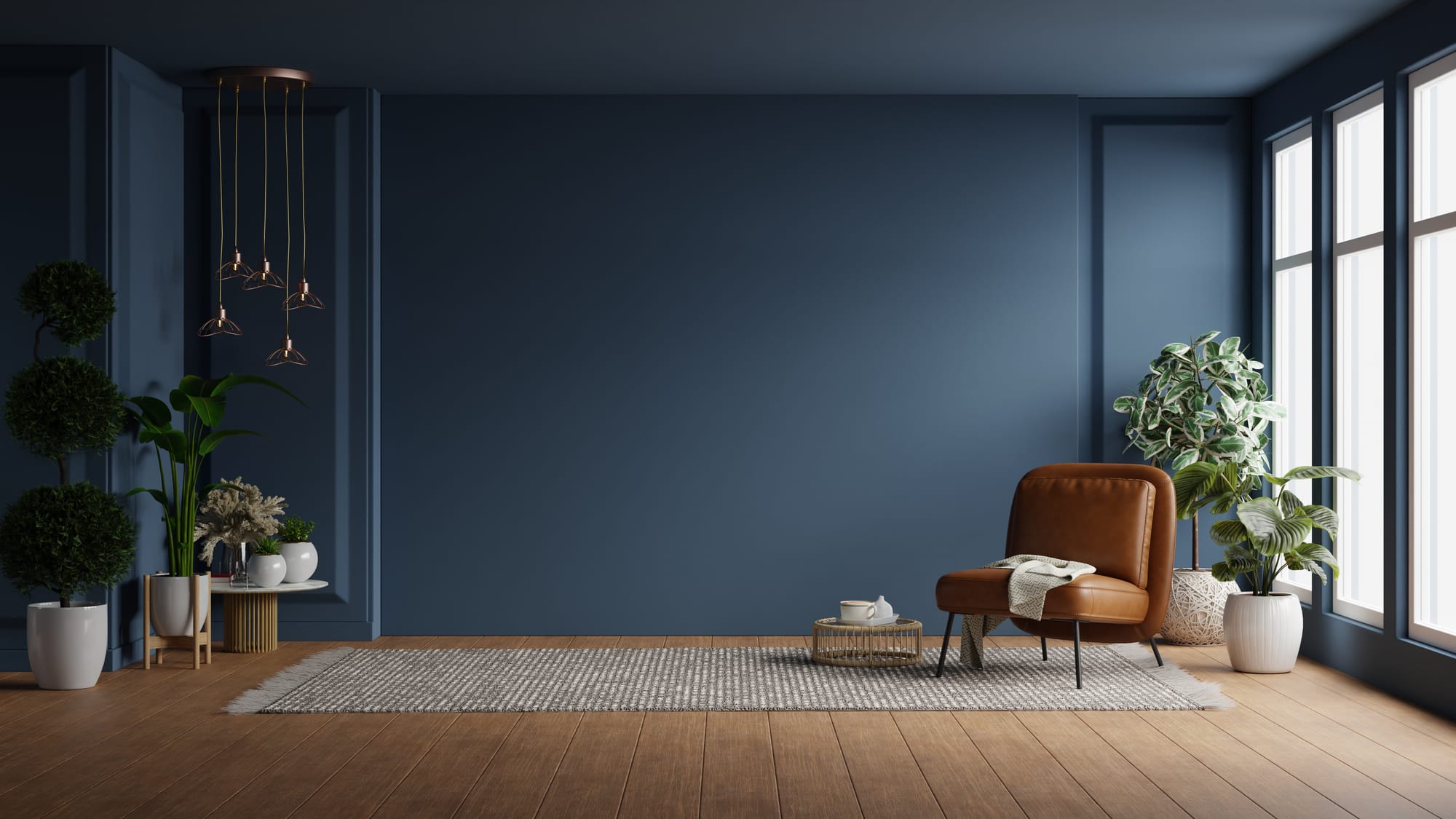
If you’re worried about color mistakes that make rooms look smaller, you’re asking the right question before the paint goes on—and that alone puts you ahead of most homeowners. Paint color has a massive impact on how big, bright, and comfortable a room feels. The problem? A few very common color mistakes can quietly shrink a space, lower perceived home value, and make a room feel darker or tighter than it actually is.
I’m writing this from the perspective of Lightmen Painting, where we fix these mistakes all the time. In this guide, I’ll walk you through the most common paint color mistakes that make rooms look smaller, why they happen, and—more importantly—exactly how to fix them without tearing your house apart.
This is practical, contractor-backed advice designed to help your next paint job actually improve the space.
Things to Know
- Dark colors shrink rooms when overused
- Ceiling color has a huge impact on space perception
- Undertones matter more than color names
- High contrast can break visual flow
- Finish choice affects light and depth
How Much Does Paint Color Really Affect Room Size?
Can paint color actually make a room look smaller?
Absolutely—and dramatically so.
Paint color affects:
- Light reflection
- Wall definition
- Ceiling height perception
- Depth and contrast
A room doesn’t have to be physically small to feel small. Most of the time, it’s a color problem—not a layout problem.
The Biggest Color Mistakes That Make Rooms Look Smaller
1. Using Dark Colors Everywhere (Without Contrast)
Main keyword focus: color mistakes that make rooms look smaller
Dark paint isn’t the enemy—but using it incorrectly is.
Why this shrinks a room:
- Absorbs light instead of reflecting it
- Removes visual depth when overused
- Blurs wall boundaries
Common mistake:
- Dark walls + dark trim + dark ceiling
How to fix it
- Use dark colors on one wall only
- Pair dark walls with lighter trim
- Keep ceilings light to preserve height
Dark colors should frame a room—not swallow it.
2. Painting the Ceiling Too Dark
Does ceiling color affect room size?
More than almost anything else.
A dark ceiling:
- Visually lowers the room
- Creates a boxed-in feeling
- Reduces perceived airiness
This is one of the fastest ways to make a room feel cramped.
How to fix it
- Use a lighter ceiling color than the walls
- Choose soft white, not bright white
- Avoid matching wall and ceiling color in low-ceiling rooms
Ceilings should lift the room, not press it down.
3. Choosing Colors With the Wrong Undertones
Can undertones make a room feel smaller?
Yes—and this is where most people get burned.
Examples:
- Blue-gray in low light = cold and cave-like
- Yellow-beige in artificial light = dingy
- Green-heavy neutrals = muddy shadows
The color isn’t “wrong” on the chip—it’s wrong for the room.
How to fix it
- Test colors in your actual lighting
- Match undertones to flooring and cabinetry
- Favor warm neutrals in low-light spaces
Undertones matter more than color names.
4. Too Much Contrast Between Walls and Trim
Can contrast make rooms look smaller?
Yes—when it’s too harsh.
High-contrast mistakes:
- Dark walls + bright white trim
- Bold wall color + stark white ceiling
This creates hard visual stops that chop the room up.
How to fix it
- Use softer whites for trim
- Reduce contrast in small or narrow rooms
- Keep trim subtle, not attention-grabbing
Contrast should guide the eye—not interrupt it.
5. Using Flat, Heavy Colors With No Variation
Why do some rooms feel flat and tight?
Because everything is the same visual weight.
Mistakes:
- Same color on all walls, trim, and ceiling
- No variation in sheen or tone
- No focal points
Flat doesn’t mean minimal—it means lifeless.
How to fix it
- Use one accent or feature wall
- Vary finish (eggshell walls, satin trim)
- Introduce depth through tonal shifts
Rooms need hierarchy to feel spacious.
In Our Experience
At Lightmen Painting, most “small room” complaints have nothing to do with square footage. They’re almost always color-related. When we correct undertones, reduce contrast, and rebalance ceilings and trim, rooms feel larger without moving a single wall. Paint is a perception tool—use it intentionally.
Room-by-Room Color Mistakes (And Better Options)
Living Rooms
Common mistake:
Dark gray walls in low-light living rooms
Better option:
Warm greige or soft taupe with a lighter ceiling
Living rooms need flexibility and brightness to feel open.
Bedrooms
Common mistake:
Very dark colors on all walls
Better option:
Muted blue or green on one wall, lighter neutrals elsewhere
Bedrooms should feel calm—not compressed.
Kitchens
Common mistake:
Dark walls fighting dark cabinets
Better option:
Light neutral walls + darker cabinets or island
Kitchens need light to feel functional and clean.
Bathrooms
Common mistake:
Mid-tone gray everywhere
Better option:
Soft white or light stone tones with subtle contrast
Bathrooms shrink faster than any other room with the wrong color.
Hallways & Entryways
Common mistake:
Bold or dark colors in narrow spaces
Better option:
Light, warm neutrals with consistent trim
Hallways should visually expand, not close in.
How Paint Finish Can Make Rooms Feel Smaller
Does paint sheen affect room size?
Yes—and it’s often overlooked.
Problem finishes:
- Flat paint in dark colors
- Glossy paint on uneven walls
Better choices
- Eggshell for most walls
- Satin for trim
- Flat only on very smooth surfaces
Finish controls how light moves through the room.
Using Accent Walls Without Shrinking the Room
Can accent walls make rooms look smaller?
They can—if done wrong.
Bad accent wall choices:
- Random wall selection
- Overly dark color
- No supporting contrast
How to do it right
- Choose a focal wall (fireplace, headboard, media wall)
- Keep surrounding walls lighter
- Use muted, not saturated, colors
Accent walls should add depth—not steal space.
Choosing the Right Paint System Matters
Small rooms expose bad prep instantly. Patch lines, roller marks, and uneven coverage make walls feel closer than they are.
We frequently work with professional-grade interior systems from Sherwin-Williams and Benjamin Moore because their color consistency and coverage help prevent these issues—but no paint brand can compensate for rushed prep.
Execution matters as much as color choice.
When Repainting Is the Best Fix
Should you repaint if a room feels too small?
If color is the issue—yes.
Repainting:
- Costs less than most remodels
- Delivers immediate visual change
- Often solves the problem completely
It’s one of the fastest ways to correct a space that “just feels off.”
Want to Learn How to Paint Like a Pro?
Whether you're a DIY enthusiast or dreaming of starting your own painting business, we've got you covered! Lightmen Painting now offers exclusive online Painting Courses designed to teach you real-world skills from real professionals. From prep work to perfect brush technique, we break it all down step-by-step.
👉 Check out the courses here: Lightmen Courses
Take the first step—level up your skills and paint with confidence. Let’s roll!
Do You Have Questions? Give Us A Call With Any & All! 503-389-5758
-
People Also Ask:
Do dark paint colors always make rooms look smaller?
No—but they must be used strategically with contrast and lighting.
What color makes a small room look bigger?
Light, warm neutrals and soft whites reflect light and expand space.
Should ceilings always be white?
Not always—but they should almost always be lighter than the walls.
-
Subscribe to Our Blog & Elevate Your DIY Game! Never miss a beat! Join the Lightmen Painting community and get the latest insights on painting, DIY projects, and expert tips delivered straight to your inbox.
Have something specific in mind? We’d love to hear your ideas! Let us know what topics or projects you’re curious about—your input could shape our next post.
Transform Your Space — Or Just Look Like You Know What You're Doing.
Ready to upgrade your painting game? From pro-approved tools to field-tested templates, the Lightmen Shop has the stuff the pros don’t want you to find.
Click in, gear up, and paint smarter.
If your in the Portland, Or. area and need advice or a free no obligation estimate call us at 503-389-5758 or email scheduling@lightmenpainting.com
Resources:
Thanks for stopping by Lightmen Daily! Stay tuned for more practical tips and expert advice on making your painting projects flawless, from wall to floor!
Definitions
- Color mistakes that make rooms look smaller – Paint errors that reduce visual space
- Small room paint colors – Colors that visually expand rooms
- Ceiling paint color – Color choice affecting perceived height
- Paint undertones – Hidden hues that affect lighting response
- Accent wall mistakes – Errors that reduce room size
- Interior paint finishes – Sheen levels and their visual impact
- Warm neutral paint – Greige, taupe, and stone tones
- Room size perception – How color affects spatial feel
- Interior repaint service – Professional painting to correct issues
- Light-reflective paint colors – Colors that bounce light effectively
Lightmen Painting Serving: Portland, Tigard, Lake Oswego, Tualatin, West Linn, Milwaukie, Sherwood, Happy Valley, Oregon City, Beaverton, Hillsboro, Gresham