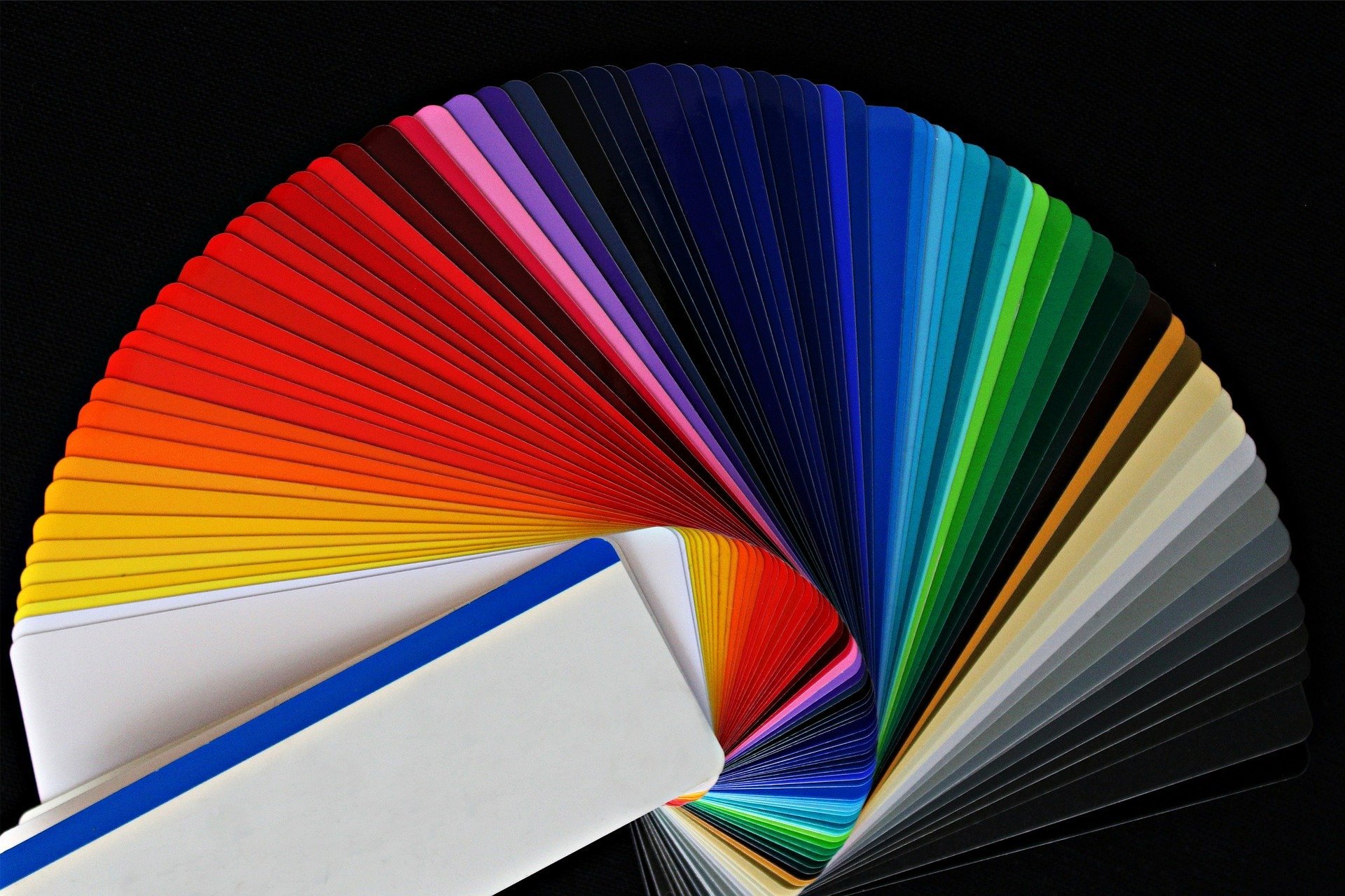
Color Psychology: How Paint Colors Change the Feel of a Room
Color psychology is the idea that colors can influence mood, behavior, perception, and how people experience a space.
In home painting, this matters because most homeowners are not just choosing a color. They are choosing a feeling.
A bedroom should feel restful.
A kitchen should feel clean and welcoming.
A home office should support focus.
A living room should feel comfortable.
A bathroom should feel fresh.
A home being listed for sale should feel move-in ready.
Paint color plays a major role in all of that.
But here is the practical side: color psychology only works when it is paired with the right lighting, finish, surface prep, trim color, flooring, furniture, and room function.
A beautiful color in one room can look completely wrong in another. Portland homes especially can be tricky because our gray skies, tree cover, older interiors, and mixed lighting can shift how colors appear throughout the day.
That is why choosing paint colors should be part design, part strategy, and part “please test the sample before painting the whole wall like a maniac.”
Things to Know
- Paint colors change dramatically depending on lighting, sheen, and undertones.
- Portland’s cloudy weather can make cool colors feel colder and darker than expected.
- Warm neutrals are usually safer for resale than bold personal colors.
- Dark colors can look high-end, but they require better prep because flaws show more easily.
- The right color still needs the right prep, primer, finish, and application to look professional.
Why Color Psychology Matters Before You Paint
Paint is one of the most cost-effective ways to change a room, but it is also one of the easiest things to get wrong.
Color affects:
- How large or small a room feels
- Whether a space feels warm or cool
- Whether a room feels calming or energetic
- How natural light reflects
- How trim and cabinets appear
- How clean or dated a home feels
- How well a room photographs
- How buyers react during a showing
- How comfortable people feel in the space
This is why color psychology is useful for more than just personal style. It can also support resale, rental appeal, professional image, and overall home value.
If you are repainting multiple rooms, it helps to work from a full-room plan instead of choosing colors one at a time. Lightmen Painting’s prep-first interior painting process focuses on surface condition, color flow, sheen, and finish quality so the final result feels intentional instead of patched together.
The Big Rule: Color Depends on the Room
There is no universal “best” paint color.
A deep navy might look incredible in a dining room but feel too heavy in a small hallway. A soft white might make one bedroom feel peaceful and another feel sterile. A warm beige might look cozy in a living room but muddy in a room with poor lighting.
Before choosing a color, ask:
- What is this room used for?
- How much natural light does it get?
- Is the light warm, cool, direct, or shaded?
- What color are the floors?
- What color is the trim?
- Are the cabinets staying the same?
- Is this for personal enjoyment or resale?
- Do I want the room to feel larger, warmer, calmer, brighter, or more dramatic?
That is the real starting point.
Color psychology is useful, but context is king. Paint without context is just expensive wall makeup.
White Paint: Clean, Bright, and Flexible
White is one of the most popular interior paint choices because it feels clean, bright, simple, and flexible.
White can make a room feel:
- Larger
- Brighter
- Cleaner
- More open
- More modern
- More minimal
White works especially well in kitchens, bathrooms, trim, ceilings, modern interiors, small rooms, and spaces where you want artwork, furniture, or architectural details to stand out.
But white is not always easy.
Some whites feel warm and creamy. Others feel crisp and cool. Some look beautiful in daylight but harsh under LED bulbs. Some look clean on the chip and then weirdly yellow, gray, blue, or sterile on the wall.
In Portland homes, white paint can be tricky because natural light is often cooler and softer for much of the year. A white that looks great online may feel cold in a shaded room.
Best uses for white:
- Ceilings
- Trim
- Kitchens
- Bathrooms
- Small rooms
- Modern interiors
- Gallery-style spaces
- Homes being prepared for sale
Watch out for:
- Choosing a white without testing it
- Pairing cool white walls with warm trim
- Using flat white in high-traffic areas
- Assuming all whites are the same
They are not. White paint has range. Annoying, expensive range.
Beige, Taupe, and Warm Neutrals: Comfortable and Timeless
Beige, taupe, cream, greige, and warm neutrals create comfort without overwhelming a space.
These colors can make rooms feel:
- Warm
- Stable
- Cozy
- Relaxed
- Traditional
- Welcoming
- Flexible
Warm neutrals are useful because they work with many flooring types, wood tones, furniture styles, and home layouts.
They are especially strong for living rooms, hallways, bedrooms, dining rooms, and homes where you want a softer feel than bright white.
Taupe and greige can be especially helpful because they blend gray and brown undertones, making them more flexible than older yellow-beige colors.
Best uses for warm neutrals:
- Living rooms
- Hallways
- Bedrooms
- Older Portland homes
- Homes with wood floors
- Transitional interiors
- Resale-friendly updates
Watch out for:
- Beige that turns too yellow
- Greige that turns too gray
- Taupe that looks muddy in poor lighting
- Warm neutrals clashing with cool cabinets or trim
If you are preparing a home for resale, warm neutrals can be a safe choice when done correctly. For listing prep, Lightmen Painting also offers painting support for Portland realtors and pre-listing updates.
Gray and Charcoal: Sophisticated, But Easy to Overdo
Gray became popular because it feels clean, modern, neutral, and professional.
Gray can make a room feel:
- Calm
- Balanced
- Sophisticated
- Modern
- Formal
- Understated
Light gray can work well in offices, bedrooms, bathrooms, and open spaces. Charcoal can create drama in dining rooms, accent walls, offices, and powder baths.
But gray is not the automatic safe choice it used to be.
Too much gray can make a home feel cold, flat, or dated. In Portland, where the weather already gives us plenty of gray for free, using too much cool gray indoors can make rooms feel gloomy.
Best uses for gray:
- Offices
- Bathrooms
- Modern bedrooms
- Accent walls
- Commercial interiors
- Rooms with strong natural light
Watch out for:
- Blue-gray in cold rooms
- Purple undertones
- Flat gray walls with no warmth
- Gray floors plus gray walls plus gray furniture
- Creating the emotional experience of a parking garage
Gray still works. It just needs balance.
Blue: Calm, Focused, and Trustworthy
Blue is often associated with calm, focus, trust, and stability.
Blue can make a room feel:
- Peaceful
- Clean
- Cool
- Focused
- Reliable
- Restful
Light blues work well in bedrooms, bathrooms, laundry rooms, and coastal-inspired interiors. Deeper blues like navy, slate blue, and indigo can add sophistication to offices, dining rooms, built-ins, cabinets, and accent walls.
Blue is especially useful where you want calm without making the room feel boring.
Best uses for blue:
- Bedrooms
- Bathrooms
- Offices
- Dining rooms
- Cabinets
- Accent walls
- Kids’ rooms when softened
Watch out for:
- Blue feeling cold in north-facing rooms
- Navy making small rooms feel heavy
- Bright blue becoming too playful for resale
- Poor sheen choice showing wall flaws
For homeowners considering a full room refresh, blue often pairs well with clean trim, updated ceilings, and coordinated wall colors. That is where a broader residential painting plan can help the room feel finished instead of half-updated.
Green and Sage Green: Natural, Balanced, and Restful
Green is connected to nature, balance, renewal, and calm.
Green can make a room feel:
- Grounded
- Fresh
- Peaceful
- Organic
- Restorative
- Balanced
Sage green, olive green, muted green, and soft earthy greens are especially popular because they bring warmth and personality without feeling too loud.
These colors work well in bedrooms, kitchens, offices, bathrooms, dining rooms, and living rooms. Green is also a strong option for homes with natural wood, plants, warm metals, stone, or earthy finishes.
Best uses for green:
- Bedrooms
- Kitchens
- Bathrooms
- Offices
- Dining rooms
- Accent walls
- Homes with natural materials
Watch out for:
- Greens that turn minty under cool lighting
- Olive tones that look muddy in dark rooms
- Bright greens that feel too intense
- Clashing with existing cabinet or tile undertones
Sage green is one of the better “personality but still calm” colors. It gives a room some life without screaming for attention like a neon gym shoe.
Yellow: Cheerful, Warm, and Risky
Yellow is associated with happiness, energy, sunlight, warmth, and creativity.
Yellow can make a room feel:
- Cheerful
- Bright
- Warm
- Optimistic
- Energetic
- Social
Used carefully, yellow can work in kitchens, breakfast nooks, laundry rooms, kids’ spaces, and small accents.
But yellow is powerful. A little yellow can feel sunny. Too much yellow can feel like living inside a highlighter.
Best uses for yellow:
- Kitchens
- Breakfast nooks
- Laundry rooms
- Small accents
- Playful spaces
- Rooms needing warmth
Watch out for:
- Bright yellow overwhelming the room
- Yellow becoming too intense in direct light
- Yellow clashing with flooring
- Pale yellow looking dingy next to white trim
If you love yellow, consider softer buttery tones, muted golds, or warm cream-based colors instead of full-strength lemon.
Red, Burgundy, and Crimson: Bold, Warm, and Dramatic
Red is associated with energy, passion, intensity, and warmth.
Deep reds, burgundy, crimson, and wine tones can create a rich, dramatic feel.
These colors can make a room feel:
- Warm
- Bold
- Elegant
- Energized
- Formal
- Intimate
Red is usually better as an accent than a whole-room color. Burgundy can work beautifully in dining rooms, powder baths, libraries, and moody accent walls.
Best uses for red tones:
- Dining rooms
- Powder baths
- Accent walls
- Historic homes
- Formal spaces
- Creative spaces
Watch out for:
- Red making a room feel smaller
- Bright red feeling aggressive
- Poor coverage requiring extra coats
- Red reflecting onto skin tones, floors, and furniture
- Resale risk if the color is too personal
Red can be stunning when it is planned well. It can also go sideways quickly. This is not a “just wing it” color family.
Orange, Coral, Salmon, and Rust: Warm, Social, and Energetic
Orange-based colors bring warmth, enthusiasm, friendliness, and energy.
Orange can make a room feel:
- Social
- Warm
- Creative
- Playful
- Inviting
- Lively
Coral, salmon, terracotta, rust, and muted orange tones are usually easier to live with than bright orange.
These colors can work well in dining areas, creative rooms, kids’ rooms, sunrooms, accent walls, and spaces that need warmth.
Best uses for orange tones:
- Dining rooms
- Creative spaces
- Accent walls
- Kids’ rooms
- Warm transitional spaces
- Rooms with earthy decor
Watch out for:
- Bright orange overwhelming the room
- Coral turning too pink
- Rust making a room feel dark
- Orange clashing with wood tones
Muted terracotta and rust tones can be beautiful in Portland homes, especially when paired with warm whites, natural wood, black accents, and earthy decor.
Purple, Lavender, Plum, and Mauve: Creative, Soft, or Luxurious
Purple is often linked with creativity, luxury, introspection, and sophistication.
Different purple tones create very different moods.
Lavender can feel:
- Soft
- Calm
- Relaxing
- Gentle
- Peaceful
Plum can feel:
- Dramatic
- Rich
- Sophisticated
- Moody
- Luxurious
Mauve can feel:
- Soft
- Romantic
- Muted
- Warm
- Elegant
Best uses for purple tones:
- Bedrooms
- Offices
- Powder baths
- Accent walls
- Creative rooms
- Kids’ rooms when softened
Watch out for:
- Purple undertones showing up unexpectedly in gray paint
- Bright purple feeling too youthful
- Dark plum making rooms feel smaller
- Lavender looking cold under certain lighting
Purple is best used with intention. It can look expensive or it can look like a teenager picked it during a dramatic life chapter. There is not much middle ground.
Black and Deep Colors: Powerful, Modern, and High-Impact
Black, deep charcoal, navy, forest green, espresso, and other dark colors can create serious impact.
Dark colors can make a room feel:
- Sophisticated
- Dramatic
- Modern
- Cozy
- Grounded
- High-end
Dark colors work well on accent walls, doors, cabinets, built-ins, powder baths, dining rooms, and offices.
They can also make trim, art, hardware, and lighting stand out.
Best uses for dark colors:
- Accent walls
- Interior doors
- Cabinets
- Offices
- Dining rooms
- Powder baths
- Built-ins
Watch out for:
- Poor wall prep showing flaws
- Low-quality paint flashing or scuffing
- Dark colors making small spaces feel heavy
- Choosing the wrong sheen
- Dust and fingerprints showing more easily
If you are considering dark colors on cabinets, built-ins, or kitchen features, it may make sense to look at cabinet painting and refinishing in Portland as part of the project. Dark cabinet colors can look incredible, but only when prep and finish quality are dialed in.
Pink, Rose, and Blush: Soft, Warm, and Human
Pink and blush tones are associated with softness, warmth, comfort, and care.
These colors can make a room feel:
- Gentle
- Warm
- Playful
- Soft
- Welcoming
- Calm
Modern pinks are often muted, dusty, or clay-based rather than bright bubblegum pink. Blush, rose, clay pink, and muted mauve can work in bedrooms, bathrooms, nurseries, powder baths, and creative spaces.
Best uses for pink tones:
- Bedrooms
- Nurseries
- Powder baths
- Accent walls
- Creative rooms
- Soft modern interiors
Watch out for:
- Pink becoming too sweet
- Blush clashing with yellow trim
- Bright pink limiting resale appeal
- Cool pink feeling flat in shaded rooms
Pink works best when it feels sophisticated, not sugary.
Brown, Bronze, Copper, and Earth Tones: Grounded and Comfortable
Brown and earth tones create a sense of warmth, stability, and comfort.
These colors can make a room feel:
- Grounded
- Secure
- Natural
- Warm
- Rustic
- Comfortable
Chocolate brown, bronze, copper, rust, clay, and warm earth tones are especially strong in spaces with wood, leather, stone, plants, and warm lighting.
Best uses for earth tones:
- Living rooms
- Offices
- Dining rooms
- Bedrooms
- Accent walls
- Historic homes
- Craftsman-style homes
Watch out for:
- Brown making rooms feel dark
- Earth tones clashing with cool gray floors
- Too many warm tones feeling heavy
- Poor lighting flattening the color
Earth tones are great when they are balanced with clean trim, good lighting, and lighter surrounding colors.
Teal, Turquoise, Aqua, and Cyan: Fresh, Creative, and Bold
Blue-green colors like teal, turquoise, aqua, and cyan can feel fresh, creative, and energetic.
These colors can make a room feel:
- Refreshing
- Creative
- Calm
- Playful
- Modern
- Invigorating
Teal is usually the most flexible of the group because it has depth and sophistication. Aqua and turquoise can feel more playful or coastal. Cyan is bold and should usually be used sparingly.
Best uses for blue-green tones:
- Bathrooms
- Offices
- Accent walls
- Kids’ spaces
- Creative rooms
- Laundry rooms
- Powder baths
Watch out for:
- Aqua feeling too beachy
- Cyan becoming too intense
- Teal looking too dark without enough light
- Blue-green colors clashing with warm flooring
These colors are great when you want personality, but they need careful pairing with trim, flooring, and lighting.
How Lighting Changes Paint Colors
Lighting can completely change how a paint color looks.
The same paint color may look:
- Warmer in south-facing rooms
- Cooler in north-facing rooms
- Brighter in rooms with direct sun
- Duller in shaded rooms
- Yellow under warm bulbs
- Blue or gray under cool bulbs
- Darker during Portland’s cloudy months
That is why paint samples matter.
Do not choose a color from a tiny chip and immediately paint the whole room. Test samples on the wall, look at them at different times of day, and compare them next to trim, flooring, furniture, and cabinets.
This is especially important for whites, grays, greens, blues, and beige tones because undertones can shift hard once they are on the wall.
How Paint Finish Affects Color Psychology
Color is not the only decision. Sheen matters too.
Paint finish affects how color reflects light, how durable the surface is, and how flaws show.Common interior finishes:
Flat or matte:
Good for ceilings and low-traffic walls. Hides imperfections better but is usually less washable.Eggshell:
Common for walls. Soft appearance with better durability than flat.Satin:
Good for high-traffic areas, bathrooms, kitchens, trim, and doors depending on product choice.
Semi-gloss:
Often used for trim, doors, and moisture-prone areas. Reflective and durable but shows flaws more.
A soft, calming color in the wrong sheen can feel shiny, harsh, or cheap. A dark dramatic color in the wrong finish can show every roller mark, patch, and drywall flaw.
That is why finish selection should be part of the plan, not an afterthought.
Choosing Colors for Resale
If you are painting before selling your home, the goal changes.
You are not just choosing what you like. You are choosing colors that help buyers feel comfortable, confident, and interested.
For resale, the best paint colors are usually:
- Warm whites
- Soft neutrals
- Greige
- Light taupe
- Soft gray-beige
- Muted green
- Clean trim colors
- Fresh cabinet colors when appropriate
Avoid colors that are too personal, too loud, too dark, or too trendy unless they are used in a controlled way.
Painting before listing can help:
- Improve listing photos
- Make rooms feel cleaner
- Reduce buyer objections
- Make the home feel better maintained
- Highlight natural light
- Create a move-in-ready impression
For sellers, the safest approach is usually fresh, clean, broad-appeal color with strong prep and professional application. Nobody wants buyers staring at roller marks during a showing. That is not the emotional journey we are going for.
Choosing paint colors can get overwhelming fast, especially when lighting, undertones, trim, flooring, cabinets, and resale goals all start fighting each other. If you are planning an interior repaint in the Portland metro area, Lightmen Painting can help you choose a smarter color direction and apply it with proper prep. You can request a painting estimate or call 503-389-5758.
Room-by-Room Color Psychology Guide
Living Rooms
Living rooms should usually feel comfortable, welcoming, and balanced.
Strong color choices include:
- Warm white
- Soft beige
- Greige
- Sage green
- Taupe
- Muted blue
- Warm gray
- Earth tones
Use bolder colors carefully unless the living room gets great natural light and the rest of the design supports it.
Bedrooms
Bedrooms should usually feel calm, restful, and personal.
Strong color choices include:
- Soft blue
- Sage green
- Lavender
- Warm white
- Greige
- Taupe
- Muted mauve
- Deep navy as an accent
Avoid overly energetic colors unless you specifically want a bold bedroom.
Kitchens
Kitchens should feel clean, bright, and inviting.
Strong color choices include:
- Warm white
- Soft gray
- Greige
- Cream
- Sage green
- Navy accents
- Muted blue
- Soft yellow in limited use
Kitchen colors must work with cabinets, counters, backsplash, flooring, and lighting. If cabinets are being updated too, look at the whole palette together.
Bathrooms
Bathrooms should feel fresh, clean, and calm.
Strong color choices include:
- White
- Soft blue
- Aqua
- Sage green
- Warm gray
- Pearl
- Light beige
- Charcoal accents
Moisture, ventilation, and sheen matter here. Bathrooms punish bad paint decisions faster than most rooms.
Home Offices
Home offices should support focus and clarity.
Strong color choices include:
- Slate blue
- Navy
- Sage green
- Soft gray
- Taupe
- Warm white
- Charcoal accent
- Muted teal
Avoid colors that feel too sleepy or too chaotic. You want focus, not nap mode or circus mode.
Dining Rooms
Dining rooms can handle more drama.
Strong color choices include:
- Burgundy
- Navy
- Deep green
- Charcoal
- Warm neutral
- Plum
- Terracotta
- Rich taupe
Dining rooms are a good place to use deeper colors because they are often used for shorter periods and can feel more intimate.
Kids’ Rooms
Kids’ rooms can be fun without becoming overwhelming.
Strong color choices include:
- Soft blue
- Muted green
- Warm white
- Pastel tones
- Coral accents
- Lavender
- Soft yellow
- Playful accent walls
Avoid going too intense on every wall. Kids grow. Neon does not age gracefully.
Accent Walls
Accent walls are useful when you want personality without committing the entire room to a bold color.
Good accent wall colors include:
- Navy
- Charcoal
- Forest green
- Burgundy
- Terracotta
- Teal
- Plum
- Deep brown
- Wallpaper or texture paired with paint
Accent walls work best when the wall already makes sense as a focal point, such as behind a bed, fireplace, sofa, dining table, or desk.
For inspiration, you can browse Lightmen Painting’s project gallery to think through how color, trim, and finish quality affect the final feel.
In Our Experience
In our experience, homeowners usually struggle less with “what color do I like?” and more with “what color actually works in this room?” Lighting, flooring, trim, cabinets, ceiling color, and wall condition all affect the final result. The best interior paint jobs start with a practical plan: choose the mood, test the color, prep the surfaces, pick the right sheen, and then apply the finish cleanly. Color gets the attention, but prep keeps it from looking like a weekend mistake with receipts.
The Biggest Paint Color Mistakes Homeowners Make
Color mistakes are common, and most of them are avoidable.
The biggest mistakes include:
- Choosing from a tiny paint chip
- Ignoring lighting
- Forgetting undertones
- Using too many colors in one home
- Choosing trendy colors without thinking long term
- Skipping samples
- Ignoring flooring and cabinets
- Choosing the wrong sheen
- Painting over damaged walls without prep
- Forgetting how the color will photograph for resale
Paint color is emotional, but the process should be practical.
A good color plan should consider beauty, function, lighting, flow, maintenance, and the condition of the surfaces being painted.
Why Prep Still Matters More Than Color
A great color cannot save a bad paint job.
If the walls are dirty, patched poorly, glossy, damaged, or uneven, the final color will not look right. Dark colors will show flaws. Shiny finishes will highlight texture problems. Light colors may reveal poor coverage or flashing.
Before painting, walls may need:
- Cleaning
- Drywall repair
- Sanding
- Caulking
- Spot priming
- Stain blocking
- Texture correction
- Trim prep
- Proper masking
- Product selection by room
This is why professional painting is not just “put color on wall.”
The color is the part everyone sees. The prep is the reason it actually looks good.
Lightmen Painting’s painting process is built around that idea: get the surface right, choose the correct materials, and then apply the finish cleanly.
When to Hire a Professional Painter for Color-Driven Projects
You may want professional help if:
- You are repainting multiple rooms
- You are preparing a home for sale
- You are changing from dark to light colors
- You are using bold or deep colors
- Walls need repair
- Trim needs repainting
- Cabinets are part of the update
- You want a cleaner, more durable finish
- You do not want to spend three weekends fighting blue tape and regret
DIY can work for small, simple rooms. But for larger projects, resale updates, cabinet-adjacent work, major color changes, or high-visibility spaces, professional prep and application can make a major difference.
For full interior updates, start with Lightmen Painting’s interior painting services and build the color plan around the actual room conditions.
People Also Ask
What is color psychology in interior painting?
Color psychology in interior painting is the idea that paint colors influence how a room feels and how people experience the space. For example, blue can feel calming, yellow can feel cheerful, green can feel balanced, and dark colors can feel dramatic or sophisticated.
What interior paint colors are best for a calming room?
Soft blues, sage greens, warm whites, taupe, muted lavender, and soft beige tones are often good choices for calming rooms. Bedrooms, bathrooms, and reading spaces usually benefit from softer colors and lower-contrast palettes.
What paint colors are best for selling a home?
Warm whites, soft neutrals, greige, light taupe, and clean trim colors are usually safer for resale. The goal is to make the home feel clean, bright, and move-in ready without distracting buyers with overly personal color choices.
Do dark paint colors make a room feel smaller?
Dark colors can make a room feel smaller, but they can also make a space feel cozy, dramatic, and high-end when used correctly. Good lighting, clean trim, and the right sheen make a big difference.
Should I test paint colors before painting?
Yes. Always test paint colors before painting a full room. Paint can look very different depending on natural light, artificial light, flooring, trim, furniture, and time of day. This is especially important in Portland homes with shaded rooms or cooler natural light.
If you are planning an interior repaint in the Portland metro area, Lightmen Painting can help you choose colors that fit the room, the lighting, and the goal of the project. Whether you are updating one room, repainting before selling, refreshing cabinets, or improving the feel of your whole home, start with a smart plan and proper prep. You can request an estimate from Lightmen Painting, schedule through the Lightmen Painting calendar, or call 503-389-5758. CCB# 228370.
Lightmen Painting serves Portland, Tigard, Lake Oswego, Tualatin, West Linn, Milwaukie, Sherwood, Happy Valley, Oregon City, Beaverton, Hillsboro, Gresham, and nearby Portland metro communities.