Exploring the Psychology of Color: A Palette of Emotions

Color Psychology
Colors are powerful tools that can shape our emotions, influence our behavior, and guide our decisions. They are the silent communicators of our environment, conveying messages and setting the tone for our experiences. In this article, we will delve into the fascinating world of color psychology, focusing on two diverse sets of colors, each with its own unique emotional associations.
"I can change your mood without saying a word. What am I?"
Answer below
Empowering Environments with Color Psychology
These colors are like the notes on a painter's palette, each capable of creating a unique emotional landscape. The choice of color in interior design, branding, or even personal style can significantly impact how we feel and interact with our surroundings. Whether consciously or subconsciously, colors influence our emotions and behaviors every day.Understanding the psychology of color empowers us to create intentional and meaningful environments that align with our goals and aspirations.
Color Wheel
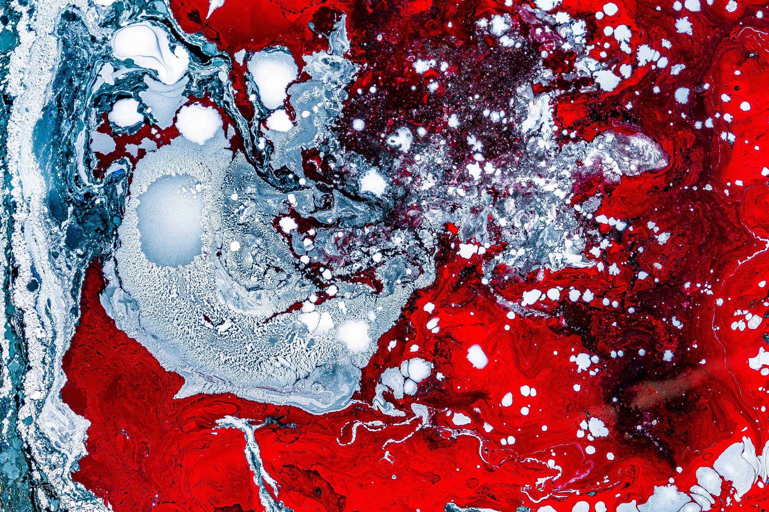
Red
Red is a color that carries strong emotional and psychological connotations, often associated with energy, passion, and excitement. Its vibrant hue can stimulate the senses, leading to an increase in heart rate and a heightened state of alertness. This makes red an effective color for capturing attention and evoking strong emotional responses. In various contexts, red is used to signify importance, danger, or to prompt immediate action, as seen in stop signs, emergency vehicles, and warning signals.
Beyond its physical and psychological impacts, red also holds cultural significance. It is a color of celebration and luck in many Asian cultures, while in Western societies, it can symbolize love and desire, as evidenced by its use on Valentine's Day. However, it's important to note that the perception of red can vary significantly depending on cultural and personal experiences.
In marketing and design, red is often employed to create a sense of urgency or to stimulate appetite, which is why it is frequently used in advertisements, promotional materials, and restaurant logos. Its ability to draw attention makes it a powerful tool for branding and visual communication, where it can convey messages of strength, power, and dynamism.
Overall, red is a multifaceted color with the ability to influence mood, behavior, and perception, making it a fascinating and powerful element in visual and psychological applications.
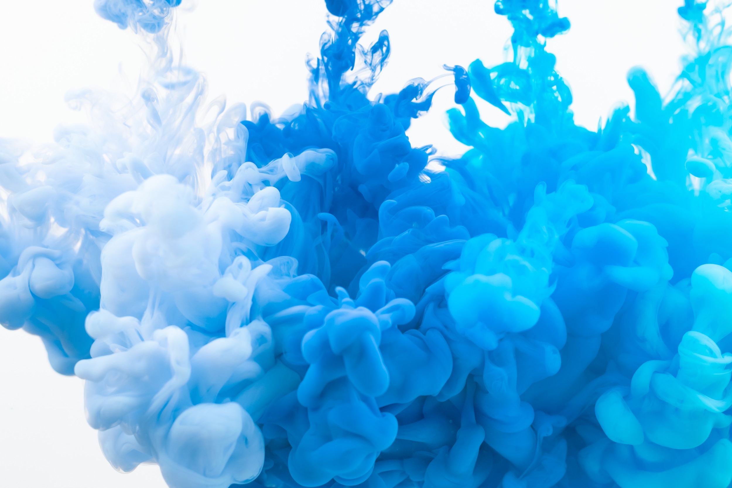
Blue
Blue, as a color, is often perceived as calming and serene, evoking feelings of peace and tranquility. This effect is due in part to its association with elements of nature, like the clear sky and the deep sea, which can induce a state of relaxation and calmness. The color blue is commonly linked with trust, reliability, and wisdom, making it a popular choice in various settings, from corporate logos to interior design, to communicate these qualities.
Lighter shades of blue are especially known for their soothing qualities. They are often used in spaces designed for relaxation and meditation, such as bedrooms and spas, to create a peaceful and tranquil environment. These lighter blues can help reduce stress and anxiety, promoting a sense of well-being and calm.
Darker blues, on the other hand, are typically associated with professionalism, strength, and stability. These shades are frequently utilized in business contexts, where they convey a sense of confidence and reliability. For example, navy blue is a common choice for business suits and corporate logos, reflecting a professional and authoritative image.
In the realm of psychology, blue's calming effect is thought to stem from its association with mental clarity and focus. It is believed that blue environments can enhance productivity and improve concentration, which is why this color is often favored in office and study spaces.
Culturally, blue holds various meanings and associations. In some traditions, it symbolizes trust and loyalty, which is why it is used in symbols of commitment, like wedding rings and military uniforms. In art and literature, blue shades can be used to convey depth, spirituality, and introspection.
In summary, blue is a versatile color that encompasses a wide range of emotions and characteristics, from calmness and serenity to professionalism and stability. Its various shades can influence mood and behavior, making it a significant color in both visual communication and psychological contexts.
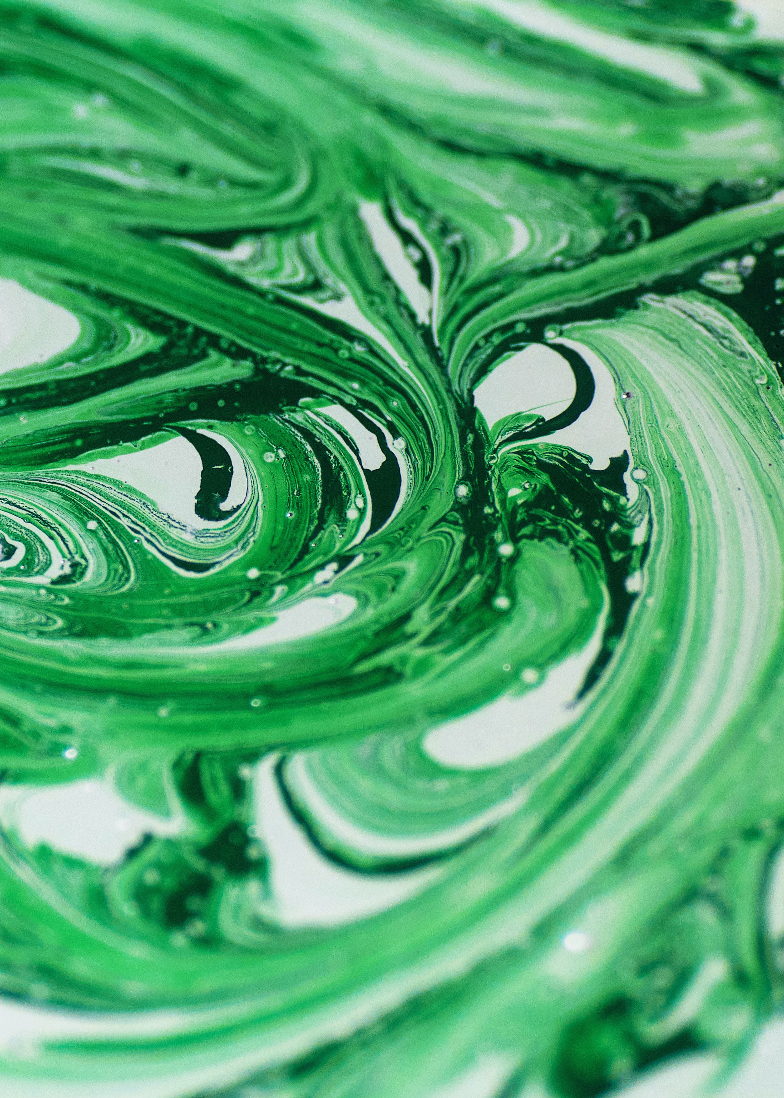
Green
Green, a color deeply intertwined with the natural world, symbolizes growth, renewal, and life. It is the hue most commonly associated with vegetation, forests, and fields, reflecting the abundance of nature and its regenerative cycles. This connection to the environment contributes to green's association with balance, stability, and sustainability, often used to denote Eco-friendly practices and products.
Psychologically, green has a calming effect on the mind and body. It can help alleviate anxiety and promote relaxation, making it a favored color in spaces designed for rest and rejuvenation, such as hospitals, schools, and homes. The presence of green in interior design is believed to enhance mental clarity and encourage efficient thinking, leading to a more balanced and harmonious environment.
In terms of color therapy, green is considered to have healing properties, aiding in stress relief and fostering a sense of well-being. Its association with tranquility and health makes it a common choice in places where peace and calm are paramount.From a cultural perspective, green carries various significance. It is often seen as a symbol of prosperity, luck, and fertility in many cultures. For instance, in Western cultures, green is associated with luck (think of the shamrock in Irish tradition), while in some East Asian cultures, it is linked to eternity, family, and peace.
In the visual arts, green is used to represent the natural world, conveying scenes of lush landscapes, vitality, and growth. In branding and marketing, green is frequently chosen to communicate environmental consciousness and organic quality, appealing to consumers who value sustainability and natural products.
Overall, green embodies a wide array of meanings, from its restorative and peaceful qualities to its representation of life and natural beauty. Its presence can transform spaces and objects, imbuing them with a sense of balance, health, and vitality.
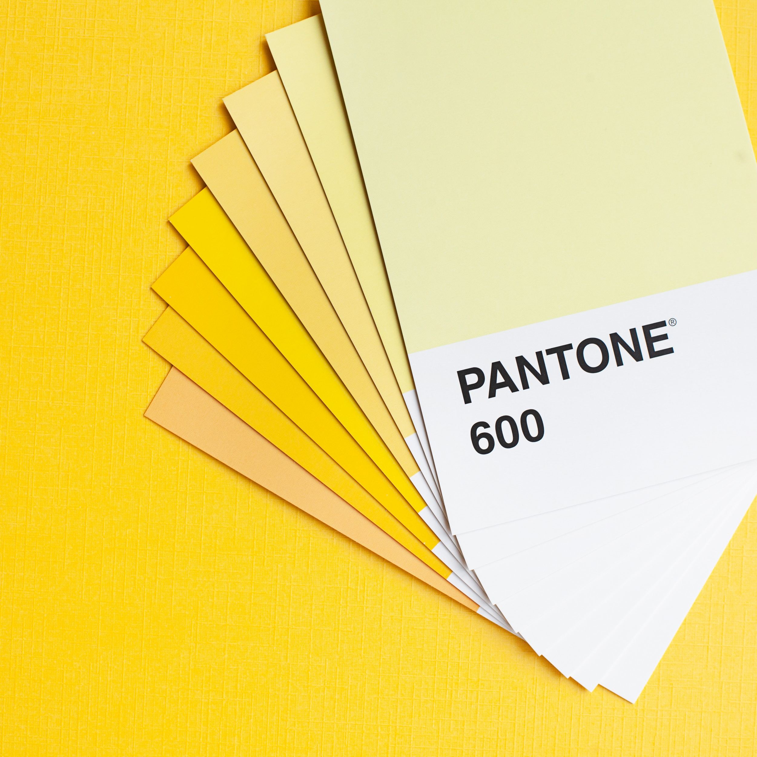
Yellow
Yellow, with its bright and luminous quality, is often associated with the sun and its life-giving energy, symbolizing happiness, positivity, and optimism. This color is known to evoke feelings of joy and vibrancy, making it a powerful mood enhancer that can stimulate cheerfulness and mental activity. Its association with light and sunshine contributes to its reputation as a color that can lift spirits and foster a welcoming atmosphere.
In the realm of psychology, yellow is considered a color that stimulates mental processes and encourages communication. Its ability to boost creativity is particularly noted, as it is thought to activate the logical side of the brain, leading to quicker decision-making and the generation of new ideas. This makes yellow a popular choice in environments that aim to promote innovation and creative thinking, such as design studios, classrooms, and workspaces.
The warmth of yellow is not just a physical sensation but also an emotional one. It can create a sense of warmth and comfort, making spaces feel more inviting and cozy. This warmth is often used in interior design to create inviting and comfortable environments where people feel encouraged to relax and communicate.
Culturally, yellow holds various meanings. In some cultures, it represents courage and sacrifice, while in others, it's a symbol of wealth and prosperity. In the context of traffic lights and signage, yellow often serves as a warning or indicates caution, showing its ability to command attention and signal alertness.In art and fashion, yellow is used to attract attention and express a sense of playfulness and adventure. It can be a bold statement color or a subtle accent, depending on its hue and intensity. In marketing and branding, yellow is often employed to capture the eye, evoke a sense of optimism, and create a positive impression of products and services.
Overall, yellow is a multifaceted color with the capacity to influence emotions, behaviors, and perceptions. Its vibrant and cheerful nature makes it a powerful tool for conveying messages of happiness, warmth, and creativity, impacting various aspects of life and culture.
Orange
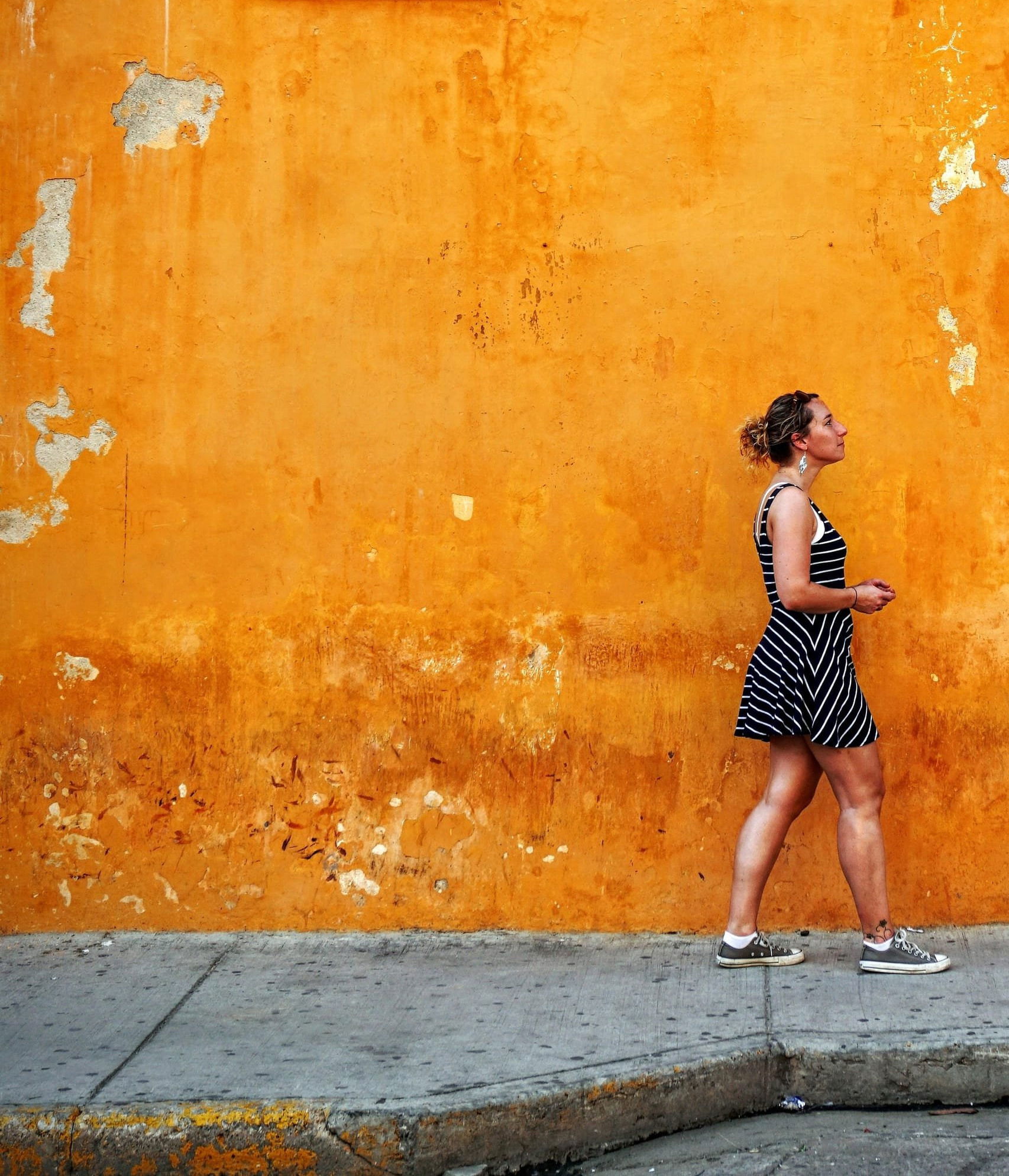
Orange, a color that combines the energy of red and the happiness of yellow, embodies a vibrant and playful essence. It is often associated with vitality, fun, and exuberance, making it a color that can stimulate creativity and enthusiasm. The presence of orange in an environment can invigorate and inspire, leading to a lively and dynamic atmosphere conducive to creative thinking and innovation.
This color is not just about energy and playfulness; it also conveys a sense of warmth and friendliness. Orange has a welcoming and sociable quality, often used in spaces and designs to create a sense of comfort and approachability. Its warm hues can make large spaces feel more intimate and inviting, fostering a sense of community and interaction.
In psychological terms, orange is thought to stimulate activity, appetite, and social interaction. It can encourage spontaneous decisions and actions, making it a popular choice in the marketing of food and entertainment. The color's ability to promote enthusiasm and excitement makes it effective for attracting attention and stimulating action, such as in call-to-action buttons or sale banners.
Culturally, orange has varied meanings and associations. In some traditions, it represents change and adaptation, like the changing leaves in autumn. In Hinduism, orange is a sacred color, symbolic of fire, purity, and spirituality. During celebrations and festivals, it's often used to express joy and energy.
In the world of art and design, orange is utilized to create bold and dynamic effects, adding depth and energy to a piece. It's particularly effective in capturing the viewer's attention and conveying a sense of movement and vitality.
In fashion and interior design, orange can be both a statement color and an accent, used to inject personality and flair into spaces and outfits. Whether in a bright tangerine hue or a softer peach tone, orange can complement various styles and settings, adding a touch of warmth and spontaneity.
In summary, orange is a color of energy, creativity, and sociability. Its vibrant and playful nature makes it effective in stimulating interaction and enthusiasm, while its warm tones convey a sense of friendliness and approachability. This makes orange a versatile and impactful color in various contexts, from visual communication to environmental design.
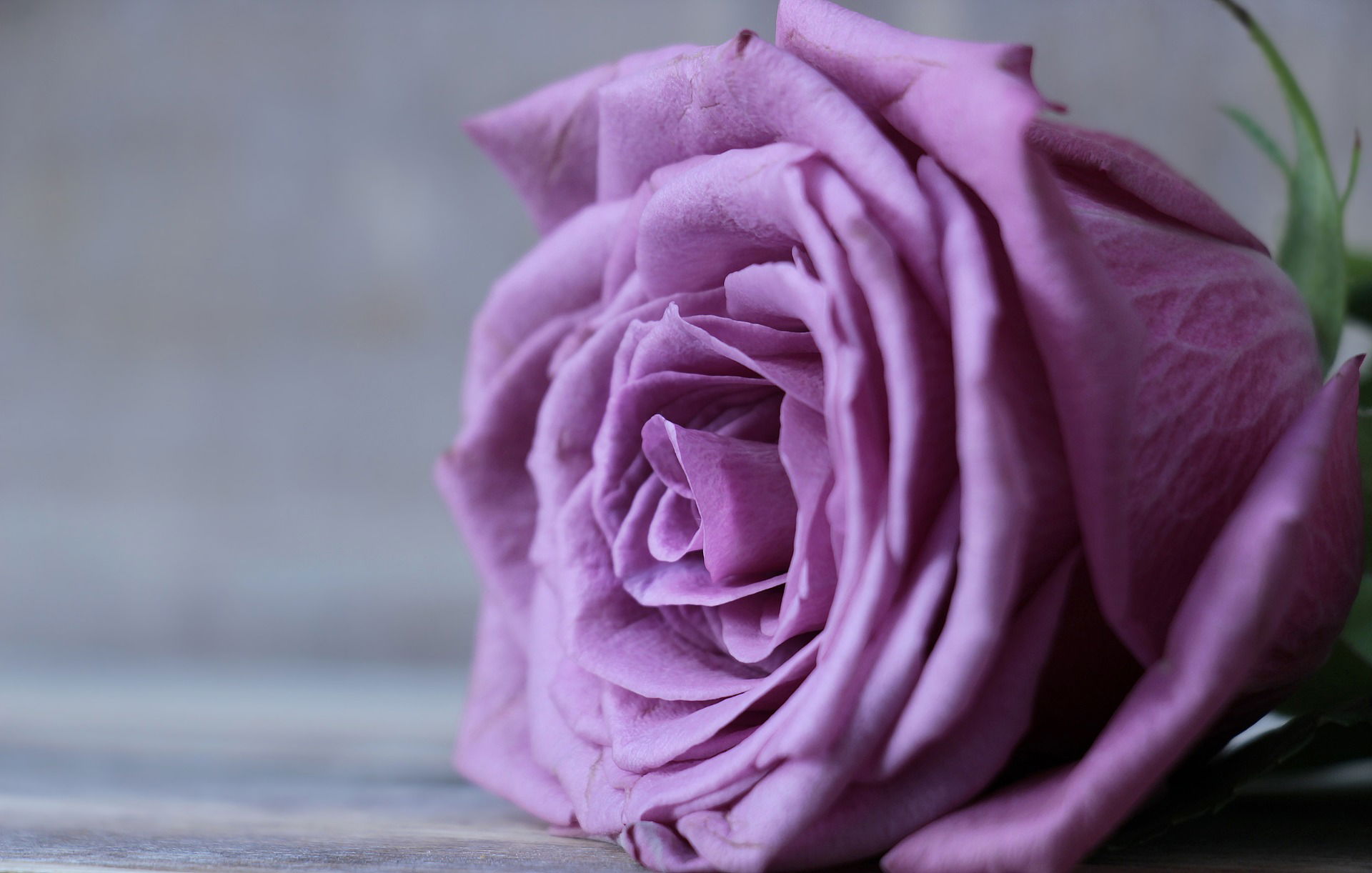
Purple
Purple, a color that historically symbolizes nobility and luxury, carries with it a rich array of associations ranging from creativity and imagination to spirituality and introspection. This color, often seen in the regalia of royalty and the vestments of clergy, represents a blend of the calm stability of blue and the fierce energy of red, creating a balance that is both soothing and dynamic.
In the realm of creativity, purple is thought to stimulate the imagination and inspire artistic expression. Its association with creativity is often linked to its ability to evoke a sense of mystery and depth, prompting individuals to explore the unknown or think beyond conventional boundaries. Artists and designers frequently use shades of purple to convey a sense of sophistication and innovation, making it a popular choice in fields that value originality and vision.
Spiritually, purple is associated with higher consciousness, wisdom, and enlightenment. It is often used in meditation spaces and spiritual gatherings to create an atmosphere conducive to introspection and contemplation. The color's connection to spirituality is also rooted in its historical use in religious ceremonies and artifacts, where it symbolizes devotion, humility, and the divine.
The sense of mystery and sophistication that purple evokes is also evident in its use in fashion and design. In these contexts, purple can convey a sense of luxury and exclusivity, often being used in high-end products and branding to denote premium quality and rarity. The color's depth and richness make it a popular choice for items that aim to project elegance and opulence.
Moreover, in interior design, purple is used to create a luxurious and comforting environment. Depending on its hue and saturation, it can be deeply invigorating or subtly serene, offering versatility in evoking different moods and styles within a space.
In summary, purple is a multifaceted color that encompasses a range of meanings and effects. Its association with luxury, creativity, and spirituality, combined with its ability to evoke mystery and sophistication, makes it a powerful color in various cultural, psychological, and aesthetic contexts.
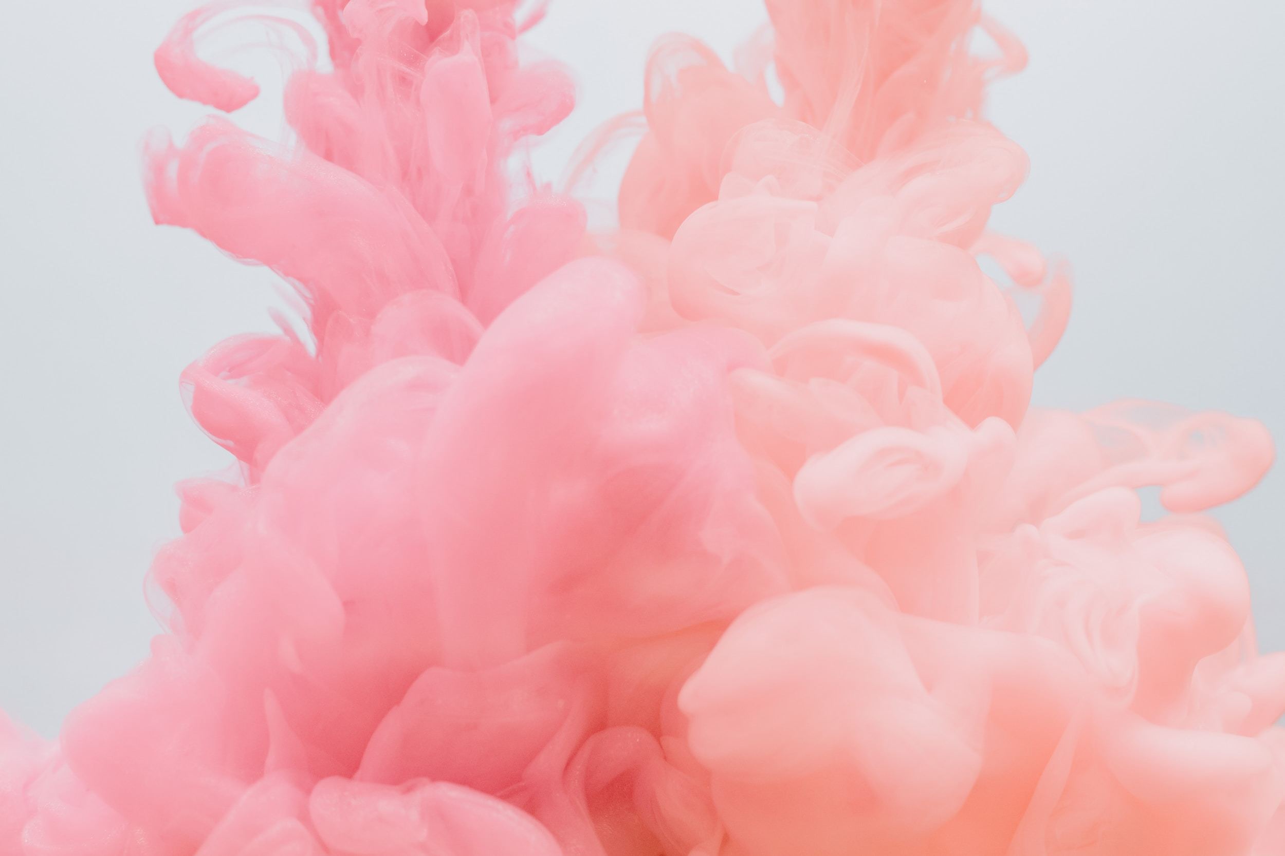
Pink
Pink, with its soft and soothing qualities, is a color often associated with tenderness, love, and compassion. It represents a nurturing and caring nature, evoking feelings of warmth, comfort, and understanding. The color's gentle appearance is frequently linked to femininity and innocence, making it a symbol of youth and gentleness in many cultures.
In the psychological realm, pink is considered to have a calming effect, capable of alleviating feelings of anger and aggression. This soothing impact is particularly attributed to lighter shades of pink, which can induce a sense of tranquility and peace. Such shades are often used in environments where the aim is to relax and comfort individuals, such as in nurseries, hospitals, and wellness centers, where they contribute to a healing and gentle atmosphere.
Pink's association with love and care is not just limited to romantic love but also extends to platonic and familial love, embodying a universal sense of nurturing and empathy. This makes it a color that can communicate affection and care in visual communications, such as greeting cards, gift packaging, and supportive environments.
In terms of color therapy, pink is used to promote emotional healing and balance, helping to soothe and nurture the mind and spirit. Its presence is thought to soften and dissolve feelings of resentment, anger, and neglect, fostering a space of forgiveness and acceptance.
In the aesthetic and design world, pink is versatile, used in various shades to create different looks and moods. While lighter pinks can add a delicate and serene touch to a design, brighter and more saturated pinks can be energizing and playful, bringing a sense of fun and vivacity.
Culturally, pink has evolved in its meanings and associations. While traditionally tied to feminine and childlike qualities, it has increasingly come to represent strength, confidence, and a breaking of gender stereotypes, demonstrating the dynamic and changing nature of color symbolism.
In summary, pink is a color with a wide range of emotional and psychological associations, from softness and soothing to love and compassion. Its ability to evoke tranquility and nurture makes it a powerful color in creating environments and designs that aim to convey gentleness, care, and affection.
Brown:
Brown, an earthy and grounding color, is closely associated with the natural world, evoking a sense of stability and reliability. This color embodies the solidity of the earth, symbolizing strength, resilience, and dependability. Brown's rich, warm tones are often used in design and decor to create a feeling of comfort and security, making spaces feel more welcoming and homely.
The color brown is seen as nurturing and supportive, akin to the fertile soil that nurtures growth. It’s this intrinsic connection to the earth that gives brown its connotation of wholesomeness and reliability. In the world of design, brown is used to convey a sense of longevity and timelessness, often associated with natural materials like wood, leather, and stone. These materials are frequently utilized in furniture and architecture to bring a sense of nature indoors and create a cozy, warm atmosphere.
Psychologically, brown is perceived as stable and grounded. It can help individuals feel more secure and stable, reducing feelings of anxiety and promoting a sense of peace and calm. The warmth of brown can make large, open spaces feel more intimate and protected, fostering an environment where people can relax and feel at ease.
In the fashion and retail industries, brown is often associated with reliability and quality. It’s used in branding and product design to communicate a sense of durability and craftsmanship, appealing to consumers who value tradition and understated elegance.
Culturally, brown has various meanings and associations. In some contexts, it represents the earth and agriculture, symbolizing fertility and reliability. In other cases, it's associated with simplicity and modesty, representing humility and a down-to-earth attitude.
In art and decoration, brown is used to create depth and warmth, providing a solid background that allows other colors to stand out. Its versatility makes it a popular choice in interior design, where it can range from light tan to deep espresso, adapting to different styles and atmospheres.
In summary, brown is a color that conveys a sense of stability, reliability, and natural beauty. Its earthy and grounding qualities make it ideal for creating environments that are warm, cozy, and comforting, while also embodying a sense of strength and resilience.
Gray:
Gray is a color that epitomizes neutrality and balance, straddling the spectrum between black and white. It is often associated with practicality, professionalism, and a sense of formality, making it a staple in both corporate and personal fashion as well as in design. Gray's understated elegance allows it to serve as a versatile backdrop that can either stand alone or complement other colors, enhancing their vibrancy while maintaining a sophisticated profile.
In the professional world, gray conveys efficiency, sophistication, and a no-nonsense attitude. It is a color commonly chosen for business attire and office environments, where it communicates a sense of seriousness and dedication to work. The color's association with formality is not just limited to the corporate sector; it extends to various design elements, including typefaces, layouts, and product packaging, where it helps to establish a clean, clear, and authoritative presence.
Psychologically, gray can be seen as a color of compromise, being neither dark nor light, conveying a sense of calmness and neutrality. This characteristic makes it ideal for creating spaces that aim to be unobtrusive and timeless, where the emphasis is on other elements, whether in interior design, art, or multimedia presentations.
However, the use of gray must be balanced, as an overabundance can lead to feelings of dullness, detachment, or even depression. In design, combining gray with brighter or warmer colors can mitigate this effect, providing a grounded and balanced aesthetic without sacrificing energy and warmth.
In fashion, gray offers a range of shades, from light silver to deep charcoal, providing a broad palette for expressing subtlety and sophistication. It's a color that can be easily mixed and matched with almost any other color to create a variety of styles, from conservative and elegant to bold and avant-garde.
Culturally, gray can symbolize the traditional and the timeless, but it can also represent the modern and futuristic. It's a color that has been redefined over time, embodying a sense of adaptability and timelessness that makes it continually relevant in various contexts.
In summary, gray is a neutral and balanced color that represents practicality and professionalism. It offers a sense of formality and sophistication, making it a preferred choice in environments and attire that require a serious and authoritative demeanor. Its versatile nature allows it to be both a powerful standalone color and an excellent complement to other hues, providing a foundation for creativity and style in numerous applications.
Black:
Black, often associated with sophistication and power, carries a strong visual impact and is imbued with a multitude of meanings. As a color, black symbolizes strength, authority, and discipline, projecting an image of control and decisiveness. Its boldness and intensity make it a popular choice in fashion, where it is revered for its ability to convey elegance and timelessness.
In the world of design and aesthetics, black is synonymous with sleekness and sophistication. It has the unique ability to add depth and perspective, creating a sense of mystery and intrigue. This is why black is often used in luxury products and high-end branding, where it denotes exclusivity, sophistication, and a premium feel. In the realm of fashion, a little black dress or a classic black suit is considered essential for its versatility and enduring appeal, capable of making a statement of refined elegance in a variety of settings.
Black's association with formality and tradition makes it a staple in professional attire, where it conveys a sense of seriousness and reliability. In corporate and ceremonial contexts, black can signify respect and solemnity, often chosen for its ability to express dignity and sobriety.
Psychologically, black can evoke strong emotions, from the feeling of security and protection to the sense of potential and possibility. While it can sometimes represent the negative aspects of mystery, such as fear or sadness, black is also considered powerful and assertive, capable of making other colors appear brighter and more vibrant when used as a background or accent.
In visual arts, black plays a crucial role in creating contrast and emphasis, helping to define lines and shapes, enhancing the overall composition of the artwork. Its use in monochromatic art underscores its capacity to express a wide range of tones and nuances, proving its versatility and depth.
Culturally, black has various connotations, from mourning and death in some traditions to rebirth and wisdom in others. Its ability to represent both the end and the beginning, the known and the unknown, encapsulates its dual nature as a color of complexity and contradiction.
In summary, black is a color of sophistication, power, and elegance. It carries a sense of authority and mystery, making it a dynamic and impactful choice in fashion, design, and art. Its capacity to convey strength and sophistication while invoking a range of emotional and psychological responses makes it a profoundly influential color in cultural and aesthetic contexts.
White:
White is often associated with purity, cleanliness, and simplicity, embodying a sense of clarity and freshness. This color, in its pristine form, conveys a feeling of peace and calm, often used in various contexts to symbolize a new beginning or a fresh start. Its inherent brightness can create a sense of spaciousness, making environments feel more open and airy, which is why white is a popular choice in interior design and architecture.
In the realm of design, white is valued for its ability to provide a neutral backdrop that highlights other elements, whether in a visual composition, a room's decor, or a piece of artwork. It can enhance the perception of light and space, contributing to a minimalist aesthetic that emphasizes cleanliness and simplicity. This makes white an ideal choice for creating environments that aim to be serene, uncluttered, and focused.
Psychologically, white is associated with cleanliness and hygiene, often used in healthcare settings to promote a sense of sterility and efficiency. It also represents clarity of thought and purpose, providing a sense of calm and order that can help reduce feelings of clutter and chaos.
In fashion, white is synonymous with elegance and sophistication. A white outfit can convey a sense of crispness and precision, often chosen for its classic and timeless appeal. In formal wear, white is a standard color for occasions that call for a sense of purity and simplicity, such as weddings and christenings.
Culturally, white has varied and significant meanings. In many parts of the world, it is the color of peace and tranquility, often used in symbols and ceremonies that represent harmony and non-violence. In some cultures, white is associated with mourning and remembrance, symbolizing respect and reverence for the departed.
In the visual arts, white plays a crucial role in contrast and balance, helping to define spaces and highlight colors and shapes. It can be used effectively to create a focal point or to draw attention to the key elements of a design.
In summary, white is a color that represents purity, cleanliness, and simplicity. It has the power to create a sense of spaciousness and neutrality, making it a versatile choice in design, fashion, and art. White's ability to convey clarity and freshness makes it a timeless and universally appealing color in a wide range of contexts.
Turquoise:
Turquoise, a captivating color that blends the serene calmness of blue with the refreshing energy of green, embodies a unique balance of tranquility and vitality. This combination makes turquoise particularly effective in promoting relaxation and creativity, as it carries the soothing properties of blue alongside the growth and rejuvenation associated with green.
In the realm of color psychology, turquoise is seen as a color that can calm the mind while invigorating the spirit. Its presence in a space can help reduce stress and foster a peaceful yet dynamic environment conducive to creative thinking and problem-solving. This makes it an ideal color for spaces designed for relaxation and contemplation, such as spas, yoga studios, and creative workspaces, where it encourages a flow of thoughts and emotions.
The calming aspect of turquoise is reminiscent of clear tropical waters and expansive skies, evoking a sense of escape and freedom. This association with nature's most picturesque elements contributes to its ability to soothe and refresh the mind, offering a mental and emotional retreat from the stresses of daily life.
In terms of creativity, turquoise is thought to stimulate open and innovative thinking, freeing the mind from conventional constraints. It encourages communication and expression, helping individuals to articulate their thoughts and feelings more effectively. This attribute makes turquoise a popular choice in design and art, where it can inspire imaginative and original ideas.
From an aesthetic perspective, turquoise stands out for its versatility and appeal. It can be used in various decorative elements, from wall paint to accessories, providing a pop of color that is both eye-catching and harmoniously integrated into its surroundings. In fashion, turquoise adds a vibrant yet soothing touch to outfits, balancing energy and relaxation in equal measure.
Culturally, turquoise has significant meanings in various traditions, often associated with healing, protection, and spirituality. Its use in jewelry and amulets dates back centuries, believed to offer protection and bring good fortune.
In summary, turquoise is a color that effectively combines the calming aspects of blue with the invigorating qualities of green, fostering an environment that promotes relaxation and creativity. Its natural associations and psychological benefits make it a favored color in many applications, contributing to its enduring popularity and appeal.
Gold:
Gold, a color that has long been synonymous with luxury, wealth, and success, carries a rich connotation of opulence and prestige. Its association with the precious metal of the same name underlines its historical and cultural significance as a symbol of affluence and prosperity. Gold's luminous quality and rarity have made it a sought-after commodity and a standard of high value across civilizations and time periods.
In the realm of color psychology, gold is often associated with achievement and triumph. Its presence can evoke feelings of grandeur and importance, inspiring a sense of accomplishment and elevated status. This is why gold is frequently used in awards and ceremonial objects, such as trophies, medals, and badges of honor, to denote first place or highest achievement.
Aesthetically, gold adds a touch of elegance and richness to any design. It can transform objects and spaces, lending them an air of sophistication and luxury. In interior design, gold accents can elevate the ambience, creating a glamorous and refined environment. Whether in the form of decorative elements, fixtures, or furnishings, gold signifies a commitment to quality and a desire for the finest.
In fashion, gold is often used to convey a sense of exclusivity and power. Jewelry, accessories, and clothing with gold elements are seen as statements of style and prestige, favored for special occasions and high-status gatherings. Gold in fashion communicates not only personal wealth but also an appreciation for the finer things in life.
Culturally, gold holds various symbolic meanings beyond material wealth. It can represent spiritual purity, divine power, and eternal life, featured prominently in religious and sacred contexts. In art and iconography, gold backgrounds or halos are used to signify holiness and veneration.
Moreover, gold's connection to the sun and its light has endowed it with attributes of life-giving energy and immortality in many mythologies and traditions. This celestial association enhances its symbolic range, linking it not just to material wealth but also to spiritual enlightenment and cosmic power.
In summary, gold is a color that exudes luxury, wealth, and success, with the ability to evoke feelings of opulence and prestige. Its historical and cultural significance, combined with its psychological impact, makes it a powerful symbol of achievement and excellence in various domains, from fashion and design to art and ceremonial recognition.
Silver:
Silver, with its cool and reflective qualities, is often associated with the futuristic and modern, symbolizing innovation, technology, and sophistication. Its metallic sheen conveys a sense of sleekness and efficiency, embodying the cutting-edge and the progressive. Silver's association with the metals and materials used in technology and industry underscores its connection to the modern world, where it represents precision, functionality, and futuristic elegance.
In the realm of design, silver is frequently used to suggest a minimalist yet high-tech aesthetic, perfect for conveying a sense of advanced engineering and design sophistication. It’s often seen in consumer electronics, automotive design, and architectural elements, where it communicates a blend of functionality and futuristic vision. The color's ability to reflect light enhances its sleek and clean appearance, making it a popular choice for products and spaces that aim to project a modern, streamlined look.
Psychologically, silver can have a calming and balancing effect, partly due to its association with cool and reflective properties. It is seen as a color of clarity, purity, and focus, helping to create an environment that encourages logical thinking and mental sharpness. This makes silver an ideal color for spaces and products designed to foster concentration and productivity, such as offices, gadgets, and software interfaces.
In fashion, silver is synonymous with glamour and sophistication. It adds a touch of modern elegance to clothing and accessories, often used to make a bold statement in evening wear and high-end fashion. Silver jewelry and embellishments can transform an outfit, adding a dimension of luxury and modernity that is both striking and understated.
Culturally, silver has various symbolic meanings. It has been associated with lunar qualities, representing the coolness, clarity, and mystery of the moon. In many traditions, silver is a symbol of purity, clarity, and the ethereal, often connected to feminine energy and the natural cycle of renewal and reflection.
In summary, silver represents a fusion of the futuristic and the modern, closely tied to themes of innovation, technology, and sleek efficiency. Its reflective and cool nature makes it a color that symbolizes high-tech elegance and sophisticated minimalism, influencing design, fashion, and cultural perceptions in profound ways.
Lavender:
Lavender, with its soft and serene hue, embodies calmness and peace, offering a sense of relaxation and tranquility that is deeply valued in today's fast-paced world. This color, often linked to the fragrant flower of the same name, carries connotations of gentle serenity and soothing presence, making it a popular choice in environments and products designed to reduce stress and promote calm.
In color psychology, lavender is recognized for its ability to soothe the mind and ease anxiety. Its gentle presence can help lower stress levels, creating a peaceful and restful atmosphere. This makes it an ideal color for spaces dedicated to relaxation and meditation, such as bedrooms, spas, and therapeutic centers, where it contributes to a healing and calming environment.
The calming effect of lavender is also beneficial in reducing anxiety and promoting a sense of well-being. Its subtle yet profound influence on the emotional state makes it a favored color in therapy and wellness practices, where it is used to create a sense of safety and comfort for individuals seeking peace and relaxation.
In the aesthetic realm, lavender's soft and muted tones convey a sense of elegance and understated sophistication. It is versatile in design, capable of adding a touch of delicacy and refinement to interiors, textiles, and graphic designs. Its ability to blend well with other colors, while maintaining its distinctive presence, allows for creative and harmonious color schemes that evoke a sense of balance and tranquility.
In fashion, lavender has gained popularity for its ability to inject a peaceful and feminine touch into wardrobes, often associated with spring and renewal. Its light and airy quality can make it a refreshing and uplifting element in clothing and accessories, suitable for creating looks that are both soothing and stylish.
Culturally, lavender has various symbolic meanings. It is often associated with purity, devotion, and serenity, reflecting its use in religious and spiritual contexts. The lavender flower, known for its calming scent and medicinal properties, has been used throughout history in aromatherapy and herbal remedies to promote relaxation and alleviate stress.
In summary, lavender is a color that epitomizes calmness, relaxation, and tranquility. Its ability to reduce stress and anxiety, along with its gentle and peaceful nature, makes it a beneficial and appealing color in various applications, from interior design and fashion to wellness and therapeutic practices.
Beige:
Beige, with its neutral and versatile qualities, is a color that conveys simplicity, comfort, and understated elegance. Its earthy tone brings a sense of warmth and coziness, making it a popular choice in interior design and fashion for creating a relaxed and welcoming atmosphere. Beige's natural and unassuming presence allows it to blend seamlessly with various color palettes, enhancing its versatility and appeal in numerous design contexts.
In interior design, beige is often used as a base color to create a sense of spaciousness and light. It provides a calming and neutral backdrop that can be easily complemented with accents of more vibrant colors or enriched with textures and patterns to add depth and interest. The warmth of beige can make spaces feel more intimate and cozy, inviting relaxation and comfort in living environments.
Psychologically, beige is associated with reliability, stability, and resilience. It does not stimulate strong emotions, making it a soothing choice that promotes balance and harmony. Its simplicity and earthiness can ground a space or design, providing a sense of tranquility and ease.
In the world of fashion, beige is valued for its timeless and sophisticated appeal. It can convey a sense of luxury and refined taste, often used in garments and accessories that aim to project a classic, elegant image. Beige offers a subtle canvas that highlights the quality of the materials and craftsmanship, making it a staple in minimalist and high-end fashion.
From a cultural perspective, beige has often been associated with the natural, the organic, and the unpretentious. It can represent simplicity, honesty, and a return to basics, resonating with contemporary movements that emphasize sustainability and natural beauty.
In summary, beige is a color that epitomizes neutrality and versatility, offering simplicity and comfort while also creating a sense of warmth and coziness. Its ability to harmonize with various design elements makes it a reliable and popular choice in interior design, fashion, and beyond, where it is appreciated for its quiet charm and understated elegance.
Magenta:
Magenta, a color that stands out for its vibrancy and intensity, is often associated with creativity, individuality, and innovation. This striking hue captures attention with its boldness, representing a sense of non-conformity and uniqueness. Magenta's rich, deep color evokes feelings of excitement and passion, making it a powerful choice for expressing personality and distinctive style.
In the realm of color psychology, magenta is seen as a color of emotional balance, blending the physical energy of red with the intellectual and serene qualities of blue. This balance fosters an environment of harmony and emotional wellbeing, where creativity can flourish. Magenta is often used in creative industries and spaces as it is believed to stimulate imaginative thinking and innovative problem-solving.
Magenta's association with individuality and non-conformity makes it a favorite among those who wish to stand out and express a unique identity. In fashion and design, magenta commands attention, serving as a focal point that can transform an ordinary look or space into something extraordinary and memorable. It's a color that conveys confidence and a bold approach to life, often chosen by individuals and brands that want to make a strong impression.
In interior design, magenta can be used to add depth and vibrancy to a space, creating areas of interest and injecting a playful yet sophisticated element. Whether in home decor, art, or commercial spaces, magenta can break the monotony and bring a lively, dynamic energy.
Culturally, magenta can have various symbolic meanings, often related to spiritual and personal transformation. It is sometimes associated with intuition, psychic abilities, and a breaking of traditional boundaries, reflecting its nature as a color that defies easy categorization in the visible spectrum.
Moreover, magenta’s ability to evoke feelings of excitement and uniqueness makes it a popular choice in marketing and branding, where it can be used to convey a sense of innovation and cutting-edge appeal. Brands that use magenta aim to stand out as leaders in creativity and individual expression, appealing to consumers who value these qualities.
In summary, magenta is a color that symbolizes creativity, individuality, and emotional balance. Its vibrant and intense nature can evoke feelings of excitement and uniqueness, making it a compelling choice for expressing distinctive personality and style in various contexts, from fashion and design to personal and cultural expression.
Teal:
Teal, a color that seamlessly blends the calming aspects of blue with the invigorating qualities of green, occupies a unique space in the color spectrum that symbolizes both tranquility and vitality. This rich and versatile hue is known for its ability to promote creativity and maintain a sense of balance, making it a popular choice in various design and wellness contexts.
The calming influence of blue in teal helps to soothe the mind, reducing stress and promoting mental clarity. This aspect makes teal an excellent color for environments where relaxation and concentration are needed, such as in home offices, studios, and therapeutic spaces. The serene and restful quality of blue helps individuals to calm their thoughts and focus more deeply.
On the other hand, the presence of green in teal brings a refreshing and rejuvenating energy, encouraging growth, renewal, and balance. Green's connection to nature and life enhances the revitalizing effect of teal, making it a color that can stimulate both mental and physical well-being. This blend fosters an environment where creativity can flourish, as the color encourages a harmonious balance between relaxation and energizing inspiration.
In terms of aesthetics, teal is a sophisticated and dynamic color that can add depth and character to any space. It works well in interior design, providing a striking yet balanced backdrop that can complement both warm and cool tones. Teal's versatility makes it a favorite in the fashion industry as well, where it is used to create elegant and vibrant garments and accessories that convey a sense of uniqueness and flair.
Teal also carries connotations of balance and stability, bridging the gap between the soothing qualities of blue and the lively attributes of green. This makes it a color that can support emotional equilibrium, aiding in the creation of a serene yet stimulating atmosphere.
Culturally, teal is often associated with sophistication and a refined taste. It is seen as a color that represents healing and protection, used in various cultural artifacts and healing practices to convey a sense of wisdom and therapeutic energy.
In summary, teal is a multifaceted color that combines the calming aspects of blue with the invigorating qualities of green, promoting creativity and a sense of balance. Its ability to support both relaxation and energetic engagement makes it an effective choice for fostering environments that enhance well-being and stimulate creative expression.
Olive Green:
Olive green, an earthy and subdued shade, embodies the essence of growth and harmony, resonating deeply with nature's palette. This color, reminiscent of olives and natural foliage, symbolizes the enduring aspects of the natural world, such as resilience, renewal, and balance. Olive green's association with the earth and nature lends it a sense of stability and grounding, making it a color that can foster a strong connection to the environment and the natural cycles of life.
In design and aesthetics, olive green is often used to convey a sense of durability and timelessness. It is a color that can blend harmoniously with other natural tones, creating a cohesive and calming environment. Its understated elegance makes it a popular choice in fashion and interior design, where it is appreciated for its versatility and ability to evoke a rustic, yet refined atmosphere.
Psychologically, olive green is seen as a stabilizing force, promoting emotional balance and a sense of peace. Its connection to the earth and plant life supports feelings of relaxation and security, encouraging a grounding effect in those who encounter it. This makes olive green an excellent choice for spaces where rest and rejuvenation are priorities, such as in homes, gardens, and natural therapy centers.
The color's association with growth and renewal is not only literal, as seen in vegetation and nature, but also metaphorical, representing personal and communal development. Olive green is often used in contexts where growth, fertility, and the idea of nurturing are emphasized, embodying the potential for new beginnings and sustained progress.
In cultural and historical contexts, olive green has various meanings and associations. It has been a symbol of peace and victory, as illustrated by the olive branch, and is frequently connected to military uniforms, where it represents a blend of camouflage, readiness, and resilience.
In summary, olive green is a color that represents growth, harmony, and stability. Its earthy tones and natural associations make it a grounding force that connects individuals to nature and the wider environment. Its ability to evoke feelings of balance and tranquility, along with its symbolic connections to renewal and peace, makes it a meaningful and versatile color in various applications and cultural expressions.
Coral:
Coral, a lively and vibrant color, blends the warmth of orange with the softness of pink, creating a hue that is both energetic and soothing. This unique combination makes coral a color that symbolizes enthusiasm and playfulness, possessing the ability to boost mood and stimulate creativity. Its bright yet gentle appearance evokes the refreshing and invigorating essence of tropical reefs and sunlit oceans, making it a color that can bring a sense of joy and vibrancy to any setting.
In the psychological realm, coral is known for its uplifting and positive impact on mood. The color's inherent warmth and energy can inspire feelings of happiness and optimism, making spaces feel more inviting and lively. Its ability to enhance mood is particularly beneficial in environments where a sense of well-being and motivation is desired, such as in creative workspaces, living areas, and social gathering places.
The playful and friendly nature of coral makes it a color that encourages open and heartfelt communication. It fosters a sense of community and togetherness, facilitating interactions that are buoyant and full of life. This makes coral an excellent choice for design elements that aim to create a sociable and interactive atmosphere, such as in restaurants, schools, and community centers.
In terms of creativity, coral's vibrant yet approachable character can stimulate the imagination and encourage creative exploration. It's a color that seems to burst with potential, inspiring bold thinking and innovative solutions. Designers and artists often use coral to add a dynamic and expressive element to their work, taking advantage of its ability to energize and captivate.
Aesthetically, coral is versatile and trend-forward, easily fitting into various styles and palettes. In fashion, it can be a statement color that adds a playful and stylish edge to outfits, while in interior design, coral accents can enliven a space without overwhelming it, providing a perfect balance between energy and subtlety.
Culturally, coral has been associated with vitality and celebration. In many traditions, it represents happiness, good fortune, and protection, often used in art and decorations to convey a sense of joyful abundance and protective warmth.
In summary, coral is a color that embodies energy, enthusiasm, and playfulness. Its ability to boost mood and creativity, along with its warm and inviting nature, makes it a popular choice in various applications, from fashion and design to art and cultural expression, where it brings a refreshing and spirited energy to the forefront.
Slate Blue:
Slate blue, a color that combines the tranquil elements of blue with the earthy tones of gray, exudes a sense of calmness and sophistication. This muted yet rich hue captures the steadiness and depth of slate, a natural stone known for its durability and strength. Slate blue's association with both the reliability of gray and the serenity of blue makes it a color that can convey professionalism, trustworthiness, and a composed demeanor.
In the world of design, slate blue is often utilized for its ability to create a refined and elegant atmosphere. Its understated elegance lends itself well to corporate settings, where it can help establish an environment of calm and focused professionalism. This color is particularly favored in industries that value trust and reliability, such as finance, law, and technology, where it can reinforce a company's image as stable and authoritative.
Psychologically, slate blue's calming effect can help reduce stress and promote a sense of mental clarity. Its cool undertones provide a soothing backdrop that encourages concentration and thoughtful reflection, making it an excellent choice for spaces designed for study, meditation, or strategic thinking.
In interior design, slate blue is celebrated for its versatility and timeless appeal. It can seamlessly integrate with various decor styles, from modern minimalist to traditional elegance, providing a sense of continuity and cohesiveness. The color's ability to evoke a sense of stability and calm makes it a popular choice for bedrooms, living rooms, and office spaces, where creating a peaceful and orderly environment is desired.
In fashion, slate blue offers a sophisticated and versatile palette that can complement a wide range of colors and fabrics. It is often used in business attire and casual wear alike, offering a balance between formality and relaxed comfort, which is ideal for conveying a professional yet approachable image.
Culturally, slate blue is associated with wisdom, reliability, and timelessness. It carries a sense of enduring quality and inherent value, often used in symbols and designs that aim to represent legacy and trust.
In summary, slate blue is a color that epitomizes calmness, sophistication, and reliability. Its ability to convey a sense of professionalism and stability, combined with its aesthetic versatility, makes it a favored choice in various domains, including corporate branding, interior design, and fashion, where it communicates a subtle yet profound sense of integrity and serenity.
Burgundy:
Burgundy, a deep and rich hue reminiscent of the French wine from which it takes its name, epitomizes luxury and sophistication. This color, with its dark red and purple undertones, conveys a sense of opulence and regality, often associated with the finer things in life. Its intensity and depth create an atmosphere of elegance and exclusivity, making it a popular choice in various contexts that aim to evoke a sense of prestige and high status.
In the realm of fashion, burgundy is a color that exudes class and refinement. It is often found in evening wear, formal attire, and high-end accessories, where it adds a touch of dramatic luxury. The color's rich saturation makes it a favorite for statement pieces that aim to convey a sense of power and confidence, yet its inherent warmth allows it to remain approachable and inviting.
In interior design, burgundy is used to create spaces that feel both luxurious and cozy. It can add depth and character to a room, drawing in the eye and evoking a sense of enveloping comfort. When paired with the right materials, such as velvet or silk, and complemented by appropriate lighting, burgundy can transform an ordinary space into one of sophistication and allure.
From a psychological perspective, burgundy can stimulate feelings of ambition and determination, reflecting its association with leadership and success. Its rich depth provides a backdrop that encourages deep thought and focused contemplation, making it an ideal color for spaces used for decision-making and intellectual engagement.
Culturally, burgundy has long been associated with nobility and power. In historical times, it was a color often worn by the wealthy and the aristocratic, symbolizing their status and authority. This traditional association with wealth and luxury continues to influence its use today in various symbols and branding efforts that aim to project an image of exclusivity and prestige.
In the arts and crafts, burgundy is valued for its visual impact and emotional depth. It is used in paintings, textiles, and decorative objects to add richness and intensity, often creating a focal point that draws the viewer’s attention and holds it with its compelling presence.
In summary, burgundy is a color that symbolizes richness and elegance, closely tied to notions of luxury and sophistication. Its deep and intense hue reflects a sense of mature beauty and refined taste, making it a distinguished choice in fashion, interior design, and various forms of artistic expression, where it continues to convey a message of opulence and high quality.
Indigo:
Indigo, a color that resonates with depth and contemplation, embodies a sense of introspection and wisdom. This rich, dark blue-violet hue is often associated with the twilight hours, evoking the profound mystery and vastness of the night sky. Its intensity and depth can stimulate deep thought and meditation, making it a color that encourages looking inward and exploring the deeper aspects of the self and the universe.
In the psychological realm, indigo is believed to promote concentration and deep thinking. It is a color that can help focus the mind, aiding in the process of introspection and the pursuit of truth and knowledge. This makes indigo a favored choice in spaces designed for study, meditation, and reflection, where it supports a journey inward and fosters a sense of serenity and spiritual depth.
From an aesthetic perspective, indigo conveys a sense of sophistication and serious intent. It is often used in art and design to express complexity and nuance, offering a palette that can range from the darkly mysterious to the subtly profound. In fashion, indigo, particularly in the form of denim, combines versatility with depth, providing a garment that is both stylish and imbued with a sense of enduring appeal.
Indigo’s association with wisdom and introspection has historical and cultural roots. In various traditions, it is connected with the third eye chakra, which represents intuition and insight, further underscoring its spiritual and contemplative significance. This connection highlights indigo’s role in fostering an understanding that goes beyond the surface, encouraging a deeper engagement with life’s complexities and mysteries.
Culturally, indigo has been revered as a valuable dye, prized for its rarity and the richness of color it imparts. This history adds to its symbolism of depth and significance, suggesting a connection to heritage and time-honored traditions.
In summary, indigo is a color that symbolizes depth, introspection, and wisdom. Its contemplative nature encourages a deeper understanding and reflection, making it a color that resonates with both the mind and the spirit. In various applications, from art and design to spiritual practices, indigo continues to be a color that invites individuals to explore the depths of their own inner landscapes and the mysteries of the world around them.
Taupe:
Taupe, a neutral color that blends gray with brown, embodies versatility and understated elegance. Its unique position in the color spectrum allows it to be both warm and cool, providing a sense of balance and adaptability. This quality makes taupe an ideal choice for creating sophisticated and harmonious spaces that convey a refined sense of style and composure.
In the realm of interior design, taupe is celebrated for its ability to create a backdrop that is both calming and inviting. Its neutrality means it can complement a wide range of colors and textures, making it a popular choice for designers seeking to create spaces that are cohesive yet diverse in character. Taupe's inherent sophistication lends itself to minimalist designs where the focus is on form and material, as well as more traditional spaces where it can add a modern touch without overwhelming the senses.
From a psychological perspective, taupe's balanced nature can have a grounding effect, providing a stable and soothing environment. This can be particularly beneficial in areas where calm and concentration are needed, such as offices, living rooms, and bedrooms. The color's versatility and neutrality also make it a safe choice in fashion and design, where it can serve as a foundation or accent, blending seamlessly with other elements to enhance the overall aesthetic.
In fashion, taupe is appreciated for its timeless quality and ability to bridge seasonal color trends. It works well in a variety of materials and garments, from casual wear to more formal attire, often providing a sophisticated touch that elevates the look of an outfit.
Taupe's sophistication and balance extend to its cultural perception as well. It is often associated with reliability, practicality, and timeless elegance, qualities that make it a favored color in branding and product design, where it can convey a sense of quality and durability.
In summary, taupe is a neutral and versatile color that exudes a sense of balance and sophistication. Its ability to harmonize with a wide range of colors and styles makes it a perennial favorite in both interior and fashion design. Taupe's understated elegance and adaptability ensure its continued popularity, serving as a testament to the enduring appeal of neutrality and balance in the visual and aesthetic domains.
Rose Gold:
Rose gold, with its warm blush and metallic sheen, combines the traditional luxury of gold with the soft femininity of pink, creating a color that is both trendy and timeless. This distinctive hue has gained popularity for its ability to symbolize romance and modernity, offering a fresh and contemporary twist on classic elegance. Rose gold conveys a sense of luxury and style, making it a sought-after choice in jewelry, fashion, and design.
In the world of jewelry, rose gold stands out for its unique ability to complement a wide range of skin tones, adding a personal and intimate touch to pieces. Its romantic connotations are often associated with love and affection, making it a popular choice for engagement rings and sentimental gifts that symbolize a warm, enduring connection.
The trendiness of rose gold extends beyond jewelry into various aspects of design and fashion. It has become a favored accent in accessories, tech products, and interior design, where it adds a touch of modern sophistication and chic. Its popularity in these areas reflects a broader cultural shift towards blending traditional luxury with contemporary aesthetics, appealing to those who value both innovation and timeless beauty.
In terms of color psychology, rose gold emits warmth and positivity, with its pinkish hue evoking feelings of compassion and warmth, while the gold aspect adds an element of opulence and prestige. This combination can create environments and products that feel both luxurious and approachable, offering a sense of comfort and lavishness.
The sense of luxury associated with rose gold is also tied to its perception as a symbol of exclusivity and style. In interior design, for example, rose gold fixtures and accents can elevate the ambience of a space, imparting a subtle yet unmistakable aura of sophistication and modern elegance.
Culturally, rose gold reflects a contemporary fascination with blending traditional elements with new trends. It represents a shift in societal tastes towards colors and materials that convey both heritage and forward-thinking design, marking a move away from more conventional choices to those that express individuality and contemporary flair.
In summary, rose gold is a warm and trendy color that symbolizes romance and modernity, capable of creating a sense of luxury and style. Its unique appeal lies in its ability to merge the timeless allure of gold with the gentle touch of pink, embodying a modern sophistication that resonates with current trends in fashion, design, and personal expression.
Aqua:
Aqua, a vibrant color that combines the soothing qualities of blue with the rejuvenating energy of green, embodies a sense of refreshing invigoration. This crisp, clear hue captures the essence of water in its most picturesque form, representing clarity, purity, and calmness. Aqua's ability to evoke feelings of tranquility and freshness makes it a popular choice in design and aesthetics, where it can create spaces and products that feel serene and revitalizing.
In the realm of color psychology, aqua is often associated with mental clarity and emotional balance. Its presence can help to reduce stress and encourage a peaceful state of mind, making it an excellent choice for environments where relaxation and concentration are key. The color’s refreshing nature can invigorate the senses, promoting a sense of renewal and vitality that is both calming and energizing.
Aesthetically, aqua brings a touch of brightness and airiness to spaces, suggesting cleanliness and freshness. In interior design, it is used to create a light and breezy atmosphere, often in bathrooms, bedrooms, and living areas where a sense of openness and calm is desired. Its association with clear waters and the purity of the natural environment makes it a favored color for creating a spa-like experience in homes and commercial wellness spaces.
In fashion and accessories, aqua is valued for its vibrant yet soothing impact, capable of uplifting an outfit with a splash of cool, refreshing color. Its association with tropical seas and summer skies makes it a popular choice for clothing and accessories that aim to convey a relaxed and carefree vibe.
Culturally, aqua is often linked to notions of cleanliness, health, and vitality, reflecting its water-based origins and its symbolic connection to life and nature. This color is used in various cultural and spiritual contexts to represent healing, protection, and purity, further underscoring its significance as a color of rejuvenation and well-being.
In summary, aqua is a refreshing and invigorating color that represents clarity and purity. Its ability to create a sense of tranquility and freshness makes it a versatile and appealing choice in various fields, from interior design and fashion to health and wellness, where it continues to inspire a sense of serenity and invigoration.
Bronze:
Bronze, a warm and rustic color, evokes the durability and timelessness of the alloy from which it takes its name. This rich, metallic hue is steeped in history and tradition, often associated with the ancient artifacts and timeless sculptures that have survived through centuries. Bronze conveys a sense of solidity and resilience, symbolizing strength and enduring quality.
The warm, deep tones of bronze are reminiscent of the earth and nature, contributing to its rustic appeal. This color can create an atmosphere of warmth and comfort, imbuing spaces with a sense of history and permanence. In interior design, bronze is used to add depth and character, often through fixtures, hardware, and decorative elements that lend a touch of elegance and gravity to the environment.
Psychologically, bronze is linked to feelings of nostalgia and resilience. It can evoke memories of the past, bringing a sense of continuity and time-honored tradition. The color’s association with historical artifacts and age-old craftsmanship conveys a respect for the past and the enduring strength of human creativity and endeavor.
In terms of material and color, bronze is celebrated for its durability. Objects made from bronze or colored in its hues are often seen as investments in quality and longevity, signifying a commitment to enduring value over fleeting trends. This perception makes bronze a favored choice in the creation of medals, trophies, and plaques, where it symbolizes achievement and high standing.
In art and architecture, bronze has been used throughout history to create works that convey power, stability, and permanence. Its use in sculptures and buildings stands as a testament to human ingenuity and the desire to leave a lasting legacy.
Culturally, bronze holds various significances. In ancient times, it was a material that denoted technological advancement and cultural sophistication. Today, it continues to represent a bridge between the past and the present, embodying a blend of traditional craftsmanship and contemporary design.
In summary, bronze is a color and material that represents warmth, rustic charm, durability, and tradition. Its ability to evoke feelings of nostalgia and strength, combined with its historical and cultural significance, makes it a powerful symbol of continuity, resilience, and timeless value in various domains, from interior design and art to heritage and craftsmanship.
Navy Blue:
Navy blue, a deep and classic color, is often associated with professionalism, authority, and sophistication. Its rich, dark hue conveys a sense of seriousness and reliability, making it a staple in corporate and formal attire as well as in various design contexts. Navy blue embodies a sense of stability and trustworthiness, qualities that are highly valued in professional settings and institutions.
In the world of fashion, navy blue is a preferred alternative to black for its ability to offer depth and warmth without the starkness associated with true black. It is commonly found in business suits, uniforms, and other garments where a formal, authoritative appearance is desired. Navy blue’s association with naval attire, from which its name is derived, further reinforces its connotations of discipline and leadership.
In interior design, navy blue is used to create a sense of depth and focus, often serving as a grounding element in a color scheme. It can transform a space into one of refined elegance and calm, providing a backdrop that is both comforting and commanding. The color’s ability to convey stability and strength makes it a popular choice for office spaces, libraries, and other environments where concentration and contemplation are important.
Psychologically, navy blue is perceived as calming and centering, reducing feelings of chaos and promoting mental clarity. Its association with the vastness of the sea and the expanse of the night sky lends it a universal appeal, suggesting a world of possibilities and the enduring nature of truth and wisdom.
Culturally, navy blue is often linked to conservatism and tradition, but it also has a timeless quality that transcends fashion and trend cycles. This makes it a color that can convey a sense of heritage and continuity, appealing to those who value both the past and the present.
In summary, navy blue is a color that symbolizes professionalism, authority, and stability. Its deep and classic nature creates a sense of reliability and sophistication, making it a favored choice across various fields, from fashion and design to business and institutional settings. Navy blue's ability to convey seriousness and elegance, while providing a grounding and calming effect, underscores its enduring appeal and significance.
Pearl:
Pearl, with its soft luster and understated elegance, epitomizes sophistication and timeless beauty. This color, often associated with the precious gemstone from which it derives its name, conveys a sense of luxury and refinement, resonating with qualities of grace and delicacy. The subtle iridescence and gentle sheen of pearl give it a unique allure, making it a symbol of elegance and high status.
In the realm of fashion and jewelry, pearl is celebrated for its classic and enduring appeal. Pearls themselves have been treasured throughout history as symbols of purity and value, and the color pearl retains this association with exclusivity and class. In clothing, accessories, and bridal wear, pearl tones offer a sense of softness and sophistication, creating a look that is both refined and accessible.
In interior design, pearl is used to create serene and luxurious spaces. Its muted yet luminous quality can brighten a room while maintaining a feeling of warmth and comfort. Pearl-colored interiors and decor elements can transform an ordinary space into one of understated glamour and timeless appeal, perfect for those seeking a balance between opulence and tastefulness.
Psychologically, the color pearl is associated with calmness and tranquility. Its smooth and gentle appearance can have a soothing effect, promoting a sense of well-being and peacefulness. This makes pearl an excellent choice for environments where relaxation and serenity are desired, such as in spas, bedrooms, and contemplative spaces.
Culturally, pearl has long been regarded as a symbol of wisdom and nobility. Its use in art and decoration often signifies a connection to the refined and the revered, embodying values of knowledge and spiritual depth.
In summary, pearl is a color that symbolizes elegance, sophistication, and timeless beauty. Its association with luxury and refinement, coupled with its ability to evoke a sense of calm and tranquility, makes it a favored choice in fashion, design, and any context where an aura of grace and understated luxury is desired. Pearl's unique blend of softness and luster creates an atmosphere of gentle opulence and enduring appeal.
Salmon:
Salmon, a warm and inviting hue, combines the vibrant energy of pink with the sunny cheerfulness of orange, creating a color that embodies enthusiasm, friendliness, and approachability. Its soft yet lively character makes salmon a popular choice in various design and aesthetic contexts, where it is used to convey a sense of openness and warmth.
In interior design, salmon tones can add a welcoming and cheerful atmosphere to a space, making rooms feel more accessible and comfortable. Its inherent warmth helps to create environments that are friendly and nurturing, ideal for living areas, waiting rooms, and other spaces where a positive and inviting ambiance is desired. The color's ability to evoke approachability makes it suitable for places that aim to foster social interaction and community feeling.
In the realm of fashion, salmon is appreciated for its versatility and flattering qualities. It pairs well with a range of colors, offering a refreshing alternative to more conventional hues. Clothing and accessories in salmon shades can convey a sense of playfulness and vitality, reflecting the wearer’s approachable and open personality.
Psychologically, salmon is associated with a blend of emotional energies. The pink aspect of salmon can evoke feelings of care and compassion, while its orange tones bring a sense of optimism and sociability. This combination can have an uplifting effect on mood, encouraging friendly interactions and positive social engagement.
Culturally, salmon is often seen as a color that represents health and vitality, perhaps due to its association with the nutritious fish of the same name. Its use in various forms of art and decoration can signify a zest for life and a welcoming spirit, contributing to its perception as a color that promotes well-being and happiness.
In summary, salmon is a color that represents enthusiasm, friendliness, and approachability. Its warm and inviting nature creates a sense of accessibility and openness, making it a favored choice in settings that aim to foster a friendly and positive atmosphere. Whether in interior design, fashion, or cultural expression, salmon conveys a message of warmth and engagement, embodying a spirit of hospitality and lively interaction.
Cyan:
Cyan, a vibrant and energetic color situated between blue and green on the color spectrum, embodies a sense of creativity and innovation. Its bright, refreshing hue is reminiscent of clear skies and tropical waters, evoking feelings of freedom, openness, and inspiration. Cyan's lively character makes it a stimulating color that can enhance mood and spark the imagination, making it a popular choice in environments and designs that aim to foster innovation and creative thinking.
In the realm of color psychology, cyan is known for its invigorating and uplifting effects. It can help to clear the mind and encourage fresh thinking, which is particularly beneficial in spaces dedicated to brainstorming, problem-solving, and artistic creation. The color's association with clarity and vibrancy makes it an excellent tool for breaking through mental blocks and stimulating a more dynamic flow of ideas.
In design and aesthetics, cyan stands out for its modern and futuristic feel. It is often used in digital and graphic designs to convey a sense of cutting-edge technology and forward-thinking. This makes cyan a favored color in the tech industry and among brands that wish to project an image of innovation and progressiveness.
In interior design, incorporating cyan can create an atmosphere that is both energizing and soothing, balancing its lively qualities with a sense of calm derived from its blue-green tones. This duality makes cyan a versatile color that can adapt to various design needs, enhancing spaces with its refreshing and contemporary vibe.
In fashion, cyan adds a bold and energetic touch to clothing and accessories, often used to create eye-catching pieces that stand out for their cheerful and lively essence. Its ability to evoke a sense of playfulness and inventiveness makes it a popular choice for those looking to express a dynamic and creative personal style.
Culturally, cyan has come to symbolize the fluidity and expansiveness of the modern, digital age, often associated with virtual reality and digital media, where it represents the limitless possibilities of the virtual world.
In summary, cyan is a color that symbolizes creativity, innovation, and energy. Its vibrant and energetic nature can boost mood and stimulate the imagination, making it an effective choice in various domains, from digital design and technology to fashion and interior decorating, where it conveys a sense of freshness, modernity, and inventive spirit.
Plum:
Plum, with its deep, rich tones that blend the essence of red and blue, exudes luxury and sophistication. This color, suggestive of the fruit from which it takes its name, symbolizes opulence and extravagance, offering a sensory experience of depth and indulgence. Plum’s luscious and intense hue creates an atmosphere of lavishness and wealth, making it a popular choice in contexts that aim to convey a sense of grandeur and exclusivity.
In the world of interior design, plum is often used to impart a sense of richness and elegance to a space. Its deep, saturated color can transform an ordinary room into a sumptuous and inviting environment, ideal for creating an ambiance of comfort and luxury. Whether through plush fabrics, dramatic wall colors, or elegant accessories, plum adds a layer of sophistication and depth that can make a space feel more luxurious and thoughtfully curated.
In fashion, plum is celebrated for its versatility and depth, offering a regal alternative to more conventional dark hues like black or navy. It is frequently found in evening wear and high-end fashion, where it lends an air of mystery and allure. Accessories, garments, and cosmetics in shades of plum can convey a sense of boldness and creativity, appealing to those who wish to make a stylish and impactful statement.
Psychologically, plum is associated with wealth, creativity, and wisdom. Its rich saturation is thought to stimulate the mind and senses, encouraging deep thought and a heightened sense of awareness. This makes plum a color that not only evokes a visual sense of luxury but also stimulates intellectual and sensory engagement.
Culturally, plum has often been associated with royalty, nobility, and spiritual depth. Its use in historical and artistic contexts frequently conveys a narrative of power, luxury, and divine connection, underscoring its enduring appeal and symbolic richness.
In summary, plum is a color that represents richness, luxury, and indulgence. Its deep and vibrant tones convey a sense of opulence and extravagance, making it a favored choice in interior design, fashion, and art. Plum’s ability to evoke a sense of indulgence and sophistication, combined with its cultural and psychological associations, makes it a powerful and dynamic color in various aesthetic and symbolic contexts.
Sage Green:
Sage green, a muted and earthy hue, embodies a sense of calm, balance, and growth. This color, reminiscent of the sage plant known for its healing and medicinal properties, conveys a natural tranquility and a grounded sensibility. Its soft, subdued quality makes it a versatile and soothing color, often used in design and decor to create an atmosphere of harmony and stability.
In interior design, sage green is favored for its ability to bring the calming essence of nature indoors. It promotes a sense of relaxation and well-being, making it ideal for spaces where peace and serenity are desired, such as bedrooms, living areas, and spas. This color's association with the natural world supports a connection to the earth, fostering an environment that feels balanced and nurturing.
Psychologically, sage green is associated with healing, growth, and renewal. Its presence can soothe and rejuvenate the mind, reducing stress and encouraging a state of balance and calm. The color's link to growth and vitality makes it conducive to environments that aim to promote health and restoration, both physically and mentally.
In fashion, sage green offers a subtle and sophisticated palette that works well in various styles and materials. It can convey a sense of understated elegance and natural charm, appealing to those who prefer a muted yet distinctive look. Sage green clothing and accessories often evoke a sense of timeless style and earthy appeal, resonating with a broad audience seeking comfort and balance in their personal expression.
Culturally, sage green has been associated with wisdom and experience, reminiscent of the herb's historical use in cooking and medicine, symbolizing a deep understanding and respect for the natural world. This color often appears in art and literature as a symbol of peace, prosperity, and rejuvenation, reflecting its broad and enduring significance.
In summary, sage green is a calming and earthy color that represents balance and growth. Its ability to create a sense of harmony and stability makes it a popular choice in various fields, from interior design and fashion to art and cultural expression. Sage green's soothing and restorative qualities, coupled with its connection to nature and healing, make it a color that promotes well-being and tranquility in multiple dimensions.
Ivory:
Ivory is soft and elegant, symbolizing purity and simplicity. It can create a sense of understated luxury.
Lime Green:
Lime green is vibrant and energetic, often associated with youthfulness and playfulness. It can boost creativity and enthusiasm.
Rust:
Rust is warm and rustic, representing earthiness and durability. It can evoke feelings of comfort and nostalgia.
Periwinkle:
Periwinkle is soft and soothing, symbolizing serenity and tranquility. It can reduce stress and promote relaxation.
Burgundy:
Burgundy is rich and deep, often associated with sophistication and luxury. It can create a sense of opulence.
Tangerine:
Tangerine is bold and energetic, representing enthusiasm and vitality. It can boost mood and creativity.
Charcoal Gray:
Charcoal gray is modern and sleek, symbolizing sophistication and efficiency. It can create a sense of professionalism.
Sky Blue:
Sky blue is light and airy, often associated with peace and serenity. It can create a sense of calm and relaxation.
Mint Green:
Mint green is fresh and invigorating, symbolizing renewal and growth. It can promote a sense of rejuvenation.
Chocolate Brown:
Chocolate brown is warm and comforting, representing stability and reliability. It can evoke feelings of security.
Lilac:
Lilac is soft and calming, often associated with grace and elegance. It can create a sense of tranquility.
Crimson:
Crimson is bold and passionate, symbolizing intensity and excitement. It can evoke strong emotions and energy.
Copper:
Copper is warm and rustic, representing tradition and durability. It can create a sense of nostalgia and strength.
Teal Blue:
Teal blue is calming and balanced, symbolizing clarity and harmony. It can promote a sense of stability.
Olive Brown:
Olive brown is earthy and natural, often associated with growth and authenticity. It can create a sense of connection to the environment.
Mauve:
Mauve is soft and romantic, representing gentleness and sensitivity. It can evoke a sense of tenderness.
Steel Gray:
Steel gray is neutral and modern, symbolizing professionalism and efficiency. It can create a sense of formality and seriousness.
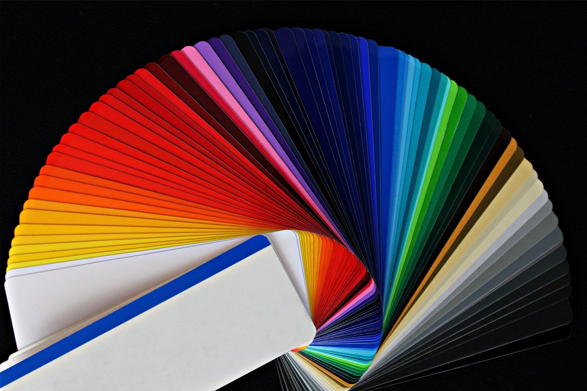
"I tried to catch some fog. I mist. Guess I’ll stick to painting clouds!"
Whether we seek the calming influence of aqua, the creative spark of cyan, or the opulent luxury of plum, there's a color waiting to evoke the emotions we desire.So, the next time you're faced with a color choice, take a moment to consider the emotions it might awaken. Whether you're designing a room, choosing a brand identity, or simply selecting your outfit for the day, let your palette guide you in creating the perfect ambiance to reflect your mood, aspirations, and intentions. After all, life is a canvas, and the colors we choose help paint our unique stories.
Do You Have Questions? Give Us A Call With Any & All! 503-389-5758
-
People Also Ask:
Can Home Depot match Sherwin Williams paint colors?
Yes, Home Depot can match Sherwin Williams paint colors. Customers can bring a paint swatch, chip, or the color number to Home Depot, where the color matching technology can recreate the desired Sherwin Williams color using Home Depot’s range of available paint brands.
How accurate is Home Depot’s color matching service?
The accuracy of Home Depot’s color matching service generally depends on several factors, including the quality of the sample provided and the condition of the color matching equipment. While the technology is sophisticated and can often produce a close match, slight variations may occur, which are sometimes noticeable when compared to the original color.
What should customers consider when choosing to match Sherwin Williams colors at Home Depot?
Customers should consider the quality of the paints available at Home Depot compared to Sherwin Williams, as there may be differences in paint formulas that could affect the finish and durability. Additionally, price and quality perception are important factors; Home Depot offers a range of brands like Behr and Glidden that may provide a different value proposition compared to Sherwin Williams paints.
-
SUBSCRIBE TO OUR BLOG: Stay informed with the latest in Painting and DIY projects by subscribing to Lightmen Painting. Get insights, tips, and more delivered straight to your inbox. We would also love to know what you would like to read about, leave thoughts on where we should go next. Interests, Topics, Ideas, all are welcome.

If your in the Portland, Or. area and need advice or a free no obligation estimate call us at 503-389-5758 or email scheduling@lightmenpainting.com
Thanks for stopping by Lightmen Daily! Stay tuned for more practical tips and expert advice on making your painting projects flawless, from wall to floor!
Definitions
- Performance and Customer Satisfaction: SuperPaint has been tested in various climates and received high satisfaction from customers for its coverage, longevity, and color retention.
- Key Features: Its weather resistance, advanced acrylic resin technology, and ease of application are highlighted as key features that contribute to its standout performance.
- Durability and Protective Qualities: SuperPaint offers exceptional durability, resistance to dirt and mildew, and long-lasting color, ensuring that exterior surfaces remain pristine and vibrant over time.
- Color Options and Aesthetic Impact: With a wide range of color options, SuperPaint enhances a home's curb appeal and visual impact, allowing homeowners to choose shades that complement their style and surroundings.
- Practical Benefits for Homeowners: SuperPaint is cost-effective in the long run, requiring less maintenance and offering reduced frequency of touch-ups compared to other paints.
- Consumer Reviews and Market Reception: Consumer feedback generally reflects high satisfaction with SuperPaint's performance, with some users noting its upfront cost as a potential drawback.
- Comparisons with Competing Products: SuperPaint often exceeds competitors in terms of weather resistance, durability, and color retention, making it a preferred choice for many homeowners.
- Final Recommendation: Based on its comprehensive performance metrics and consumer feedback, SuperPaint Exterior Acrylic Latex is highly recommended for homeowners seeking a reliable, high-quality paint for their exterior projects.
Lightmen Painting Serving: Portland, Tigard, Lake Oswego, Tualatin, West Linn, Milwaukie, Sherwood, Happy Valley, Oregon City, Beaverton, Hillsboro, Gresham