2026’s Earthy Vibrancy Paint Trend: How to Use It Without Feeling Overwhelmed
Key Features
- Complete breakdown of the 2026 earthy vibrancy paint trend
- Room-by-room guidance to avoid overwhelm
- Professional application strategies for lasting results
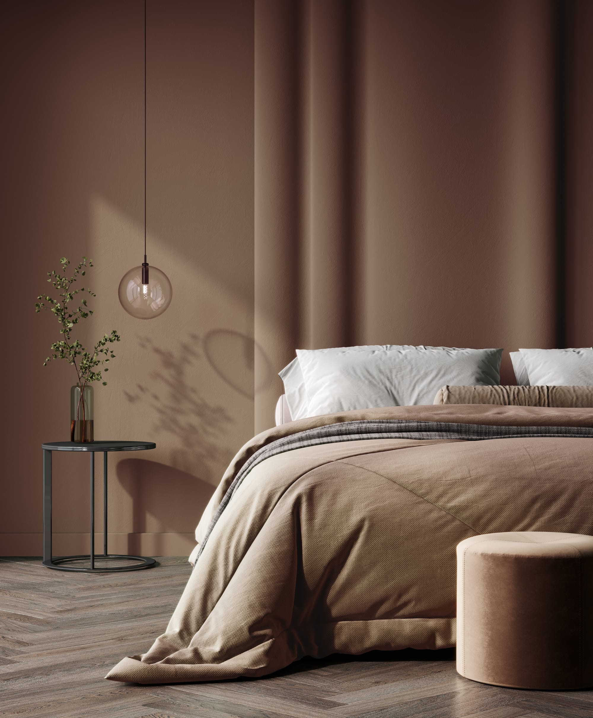
The 2026 earthy vibrancy paint trend is everywhere right now—and for good reason. Designers are leaning into grounded, nature-inspired colors with energy: clay reds, sun-baked terracottas, moss greens, golden ochres, mineral blues, and rich browns that feel alive instead of dull. It’s bold, but not neon. Warm, but not muddy. Expressive, but still livable.
We’ve already seen homeowners testing these colors in living rooms, dining rooms, and even kitchens. The excitement is real. The hesitation is real too. A lot of people love earthy vibrancy on Pinterest—but worry it’ll overwhelm their space in real life.
Let’s break down exactly how to use this trend confidently, strategically, and in a way that boosts both your mood and your home value.
What Is the 2026 Earthy Vibrancy Paint Trend?
The earthy vibrancy paint trend blends two key ideas:
- Earthy tones – grounded colors inspired by soil, stone, clay, plants, and minerals
- Vibrancy – higher saturation and depth, not washed-out neutrals
This is not beige 2.0.It’s:
- Burnt sienna instead of tan
- Olive or moss instead of gray
- Deep clay instead of taupe
- Mustard instead of cream
Designers are pulling inspiration from natural landscapes—deserts, forests, mountains—and translating those palettes into interior walls.
Things to Know
- Lighting changes everything with saturated tones
- Eggshell is usually safest for bold interiors
- Earthy colors photograph differently than they look in person
- Warm neutrals prevent color fatigue
- Prep quality matters more with deep pigments
Why Is Earthy Vibrancy So Popular in 2026?
1. People Are Tired of Cool Grays
The cool gray era dominated for years. Now homeowners want warmth again. Earthy vibrant paint colors bring warmth without feeling dated.
2. Biophilic Design Is Still Strong
Biophilic design focuses on connection to nature. Earth-inspired paint colors support:
- Reduced stress
- Improved mood
- More inviting interiors
3. Homes Are Becoming More Personal
Instead of playing it safe for resale, people are designing spaces they actually enjoy living in.
How Do You Use Earthy Vibrancy Without Overwhelming a Room?
This is where most people freeze.They love the color swatch.
They paint a whole room.
They panic.Here’s how pros approach it.
Step 1: Start with Controlled Saturation
Should you paint all four walls?
Not always.Try:
- One feature wall
- A dining room
- A powder bath
- Built-ins or cabinetry
- A ceiling (color drenching done right)
If you’re nervous, begin small.
Step 2: Balance with Neutrals
Earthy vibrancy works best when paired with restraint.Best neutral pairings:
- Warm white
- Cream
- Soft greige
- Natural wood
- Linen textiles
Think 70% calm + 30% bold.
Step 3: Choose the Right Sheen
Sheen changes how saturated color feels.
| Finish | Effect on Earthy Colors |
|---|---|
| Matte | Softens intensity |
| Eggshell | Balanced and forgiving |
| Satin | Makes color feel richer |
| Semi-gloss | Intensifies dramatically |
In most living areas, we recommend eggshell to keep vibrancy controlled.
Best Earthy Vibrant Colors for 2026
1. Terracotta & Clay Reds
Great for:
- Dining rooms
- Accent walls
- Southwest-inspired spaces
These tones feel cozy and confident.
2. Moss & Olive Greens
Perfect for:
- Bedrooms
- Offices
- Reading nooks
Green is one of the most psychologically calming colors.
3. Ochre & Golden Mustard
Best used in:
- Dining spaces
- Creative rooms
- Kitchens
These add warmth without screaming “bright yellow.”
4. Deep Mineral Blues
Works well in:
- Bedrooms
- Dining rooms
- Moody living rooms
Blue with a mineral undertone feels grounded—not nautical.
Where Should You Avoid Earthy Vibrancy?
It’s not perfect everywhere.Be cautious in:
- Tiny, low-light hallways
- North-facing rooms with cool light
- Spaces already filled with heavy wood tones
If light is limited, colors can feel heavier than intended.
Does Earthy Vibrancy Increase Home Value?
Short answer: Yes—if done thoughtfully.Buyers respond to:
- Warm, modern palettes
- Sophisticated color choices
- Spaces that feel curated
Overdone saturation can hurt value.
Strategic application enhances it.This is where working with professional interior painters helps. We understand how lighting, sheen, and prep influence the final result.
In Our Experience
The homes that embrace earthy vibrancy thoughtfully feel the most memorable. The key isn’t holding back—it’s applying color strategically. When balance, sheen, and prep align, these tones feel elevated instead of overpowering.
Pro-Level Application Tips
Here’s what most DIY blogs skip.
1. Sample Large Swatches
Not 3x3 inch chips.
Paint at least 2x2 foot test areas.
2. View at Multiple Times of Day
Morning light and evening light change everything.
3. Prep Is Critical
Rich colors show:
- Roller lines
- Dry spots
- Patch marks
Flawless prep is essential.
How to Color Drench Without Panic
Color drenching means painting:
- Walls
- Trim
- Possibly ceiling
All in one cohesive tone.
To keep it from feeling claustrophobic:
- Choose mid-tone, not darkest shade
- Use matte finish
- Add light-colored furniture
Done correctly, it feels intentional and immersive—not suffocating.
Earthy Vibrancy + Texture = Next-Level Design
Pair these tones with:
- Limewash accents
- Wood paneling
- Textured plaster
- Natural stone
Flat drywall + bold color can feel harsh.
Texture softens vibrancy beautifully.
Want the system behind this advice?
Want to Learn How to Paint Like a Pro?
Whether you're a DIY enthusiast or dreaming of starting your own painting business, we've got you covered! Lightmen Painting now offers exclusive online Painting Courses designed to teach you real-world skills from real professionals. From prep work to perfect brush technique, we break it all down step-by-step.
👉 Check out the courses here: Lightmen Courses
Take the first step—level up your skills and paint with confidence. Let’s roll!
Do You Have Questions? Give Us A Call With Any & All! 503-389-5758
-
People Also Ask:
Is earthy vibrancy just another name for warm tones?
No. It refers to warm, nature-inspired colors with deeper saturation and energy.
Will bold earth tones go out of style quickly?
Because they’re rooted in natural palettes, they tend to age better than trendy brights.
Can I use earthy vibrancy in small rooms?
Yes, but choose mid-tones and balance with lighter furnishings.
-
Subscribe to Our Blog & Elevate Your DIY Game! Never miss a beat! Join the Lightmen Painting community and get the latest insights on painting, DIY projects, and expert tips delivered straight to your inbox.
Have something specific in mind? We’d love to hear your ideas! Let us know what topics or projects you’re curious about—your input could shape our next post.
Transform Your Space — Or Just Look Like You Know What You're Doing.
Ready to upgrade your painting game? From pro-approved tools to field-tested templates, the Lightmen Shop has the stuff the pros don’t want you to find.
Click in, gear up, and paint smarter.
If your in the Portland, Or. area and need advice or a free no obligation estimate call us at 503-389-5758 or email scheduling@lightmenpainting.com
Resources:
Thanks for stopping by Lightmen Daily! Stay tuned for more practical tips and expert advice on making your painting projects flawless, from wall to floor!
Definitions
- Earthy vibrancy paint trend – Nature-inspired colors with rich saturation
- Terracotta interior paint – Clay-inspired reddish-brown tone
- Olive green wall color – Warm green with muted undertones
- Color drenching – Painting walls and trim one color
- Biophilic design – Design that connects interiors to nature
- Warm neutrals – Beige, cream, greige tones with warmth
- Eggshell finish – Low-sheen interior paint finish
- Saturated paint colors – High pigment intensity colors
- Accent wall ideas – One wall painted bold for contrast
- Interior paint sheen – Reflectivity level of paint
Lightmen Painting Serving: Portland, Tigard, Lake Oswego, Tualatin, West Linn, Milwaukie, Sherwood, Happy Valley, Oregon City, Beaverton, Hillsboro, Gresham